Product Design · April 2026
ClearPathDesigning a Supply Chain Where Both Sides Know Who Acts Next
View live product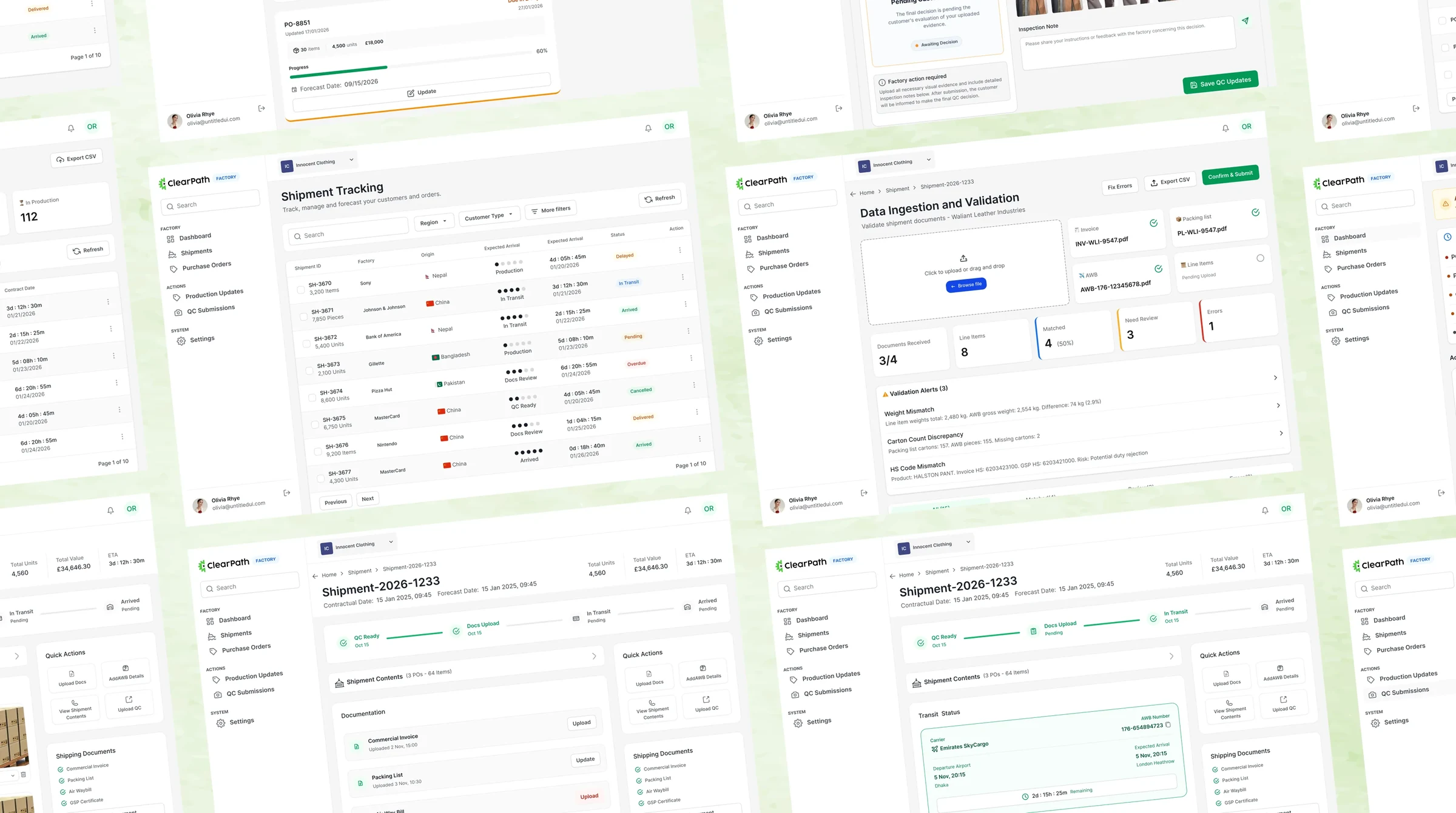
Tl;DR
A garment factory and the buyer waiting on it, working one shipment. I designed both sides.
Purchase order to arrival. Two role-scoped shells, one record, and one rule holding them together.
Problem
But.. whose job is it to fix this one?
Production updates lived in emails. Quality control happened over WhatsApp. A buyer learned about a delay by missing the window.
My role
Two shells. Two different jobs.
A factory needs to know what to do this morning. A buyer needs to know what is at risk across every factory. Same shipment, opposite questions.
The queue
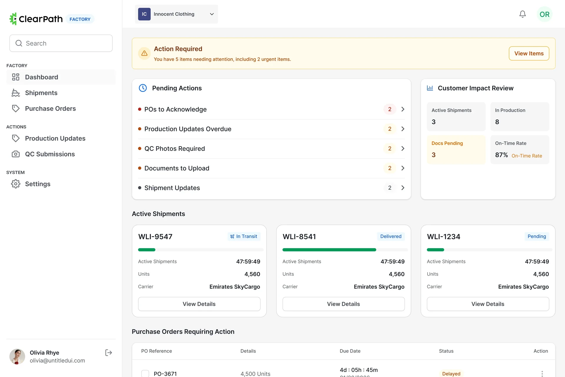
A dashboard nobody reads. A queue they do.
So the factory lands on work, not metrics — acknowledgements, overdue updates, photos and documents, each ranked and counted, with the read-only context pushed below it.
counts and severity dots rank the work
before anybody reads a number
Validation
Catch the mismatch, not the customs fine.
Invoice, packing list, air waybill and line items are checked against each other, and every discrepancy is named with its arithmetic — the weight gap, the carton count, the conflicting code.
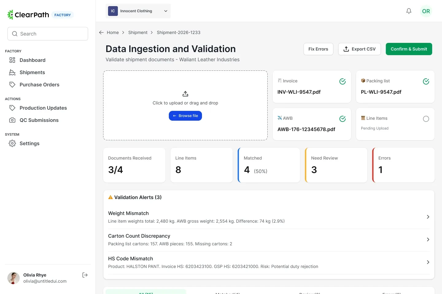
a mismatch you can read is a mismatch you can fix
Batching
A shipment is a decision, not a form.
Factories tick the purchase orders going in one crate and a floating bar keeps the running count and total units in view, so the batch is confirmed before anything is committed.
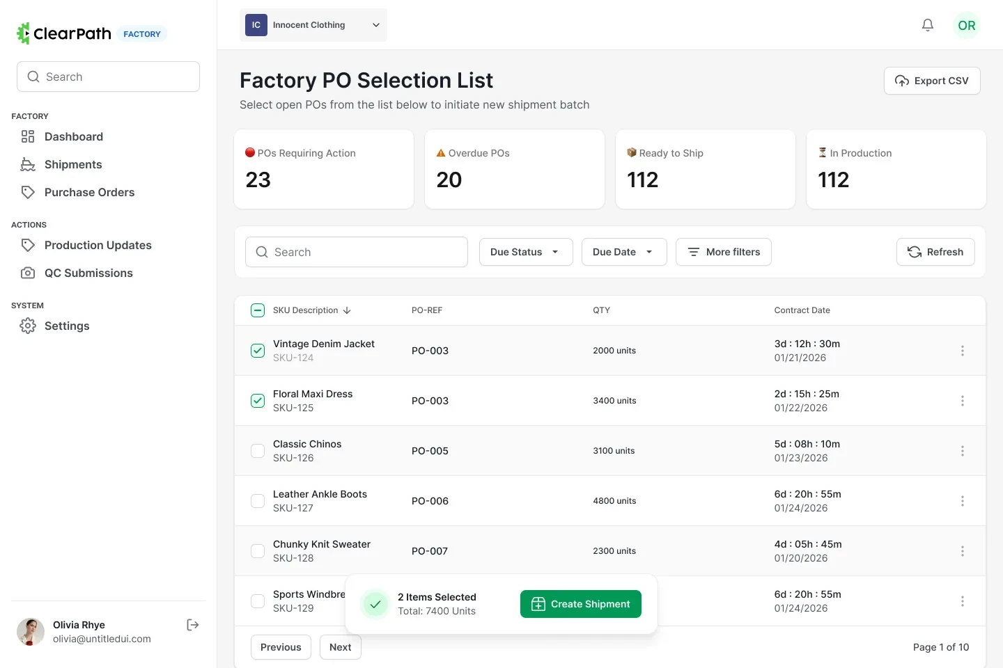
the count follows you down the list
Allocation
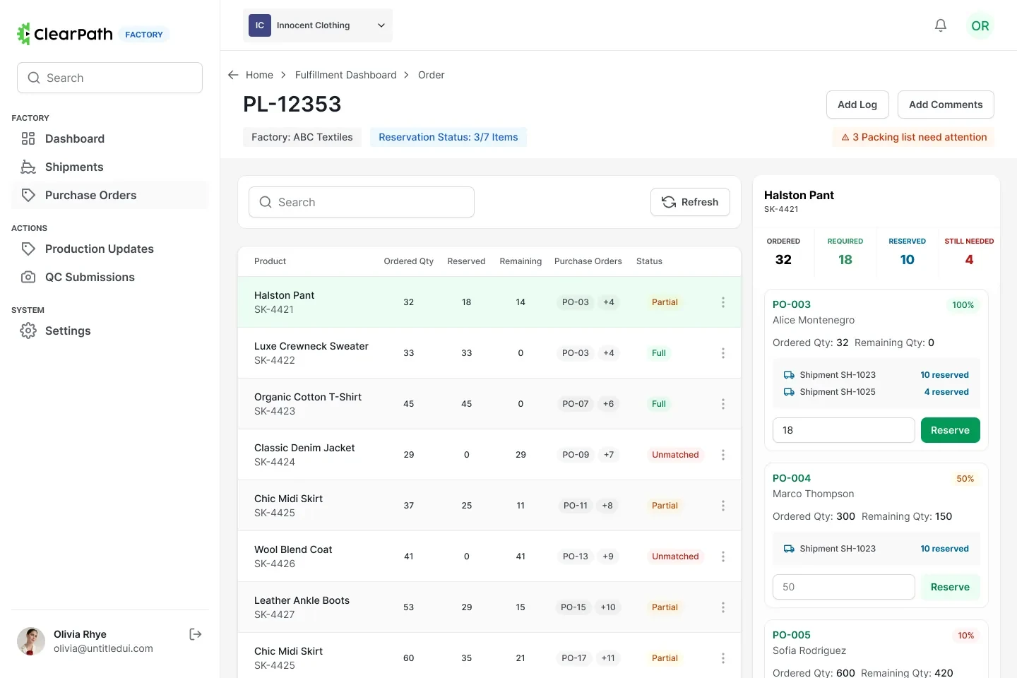
Reserve stock without losing your place.
Picking a line on the left opens its arithmetic on the right — ordered, required, reserved, still needed — so committing stock against one purchase order never costs you the filtered list you were working through.
the list stays put
while the maths opens beside it
In flight
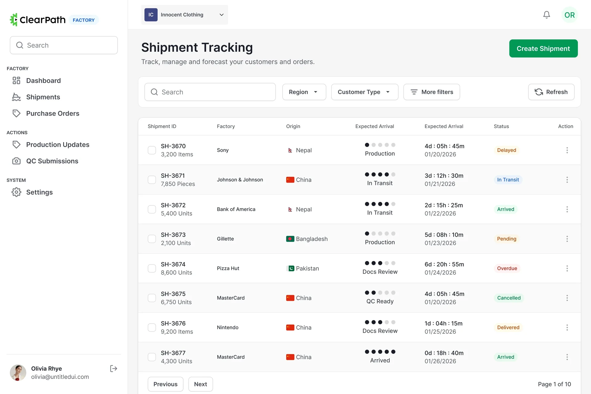
Triage the table. Open only what is wrong.
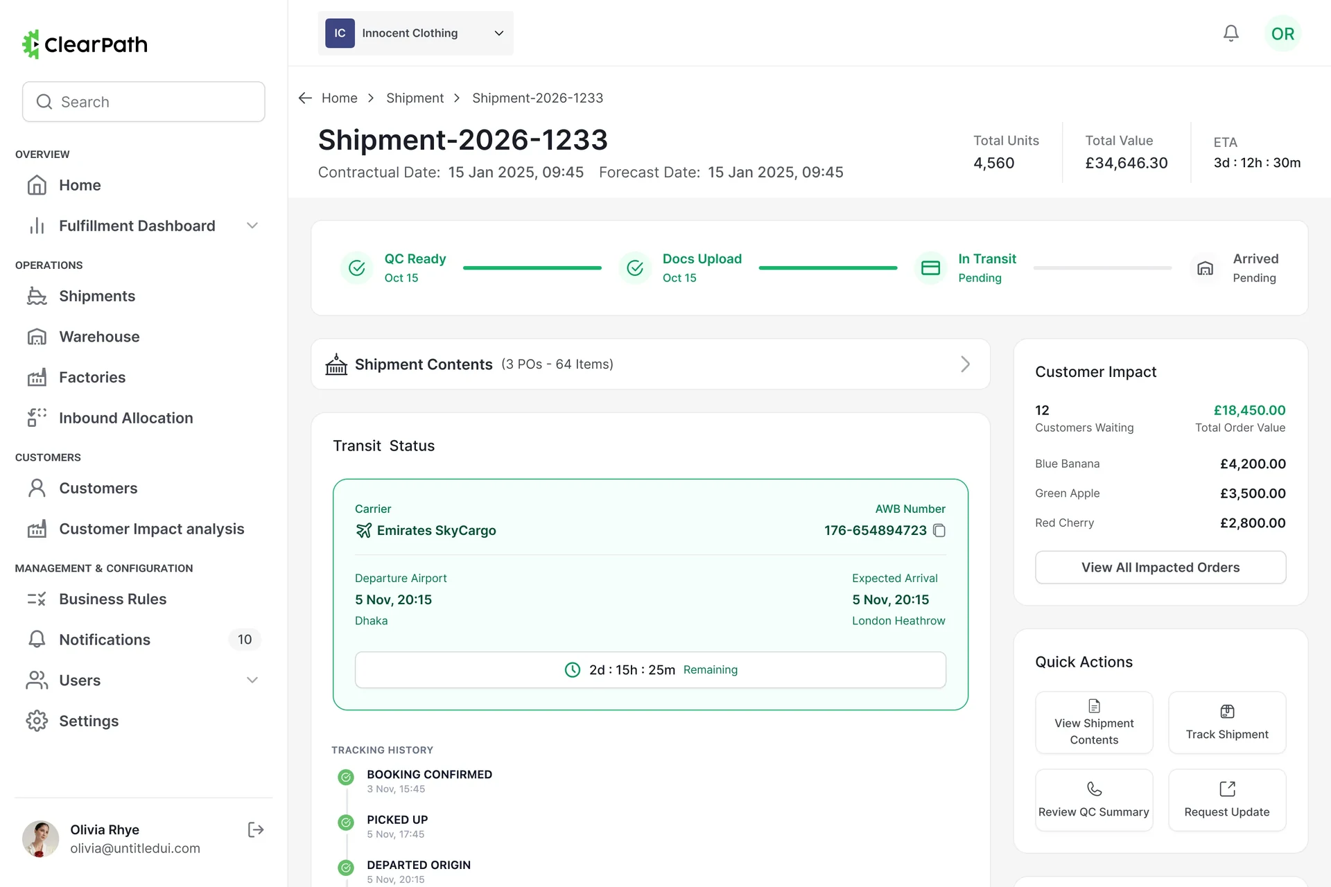
Every shipment across every factory compresses to a five-dot stage indicator, a countdown and a status badge — so the row tells you whether to click it. Open one and a customer-impact rail names who is waiting.
Missing things
The gate is the document, not a reminder email.
Four documents, each with its upload time or a red flag where there isn’t one. The stage on the tracker will not advance until all four exist, so chasing paperwork stops being somebody’s job.
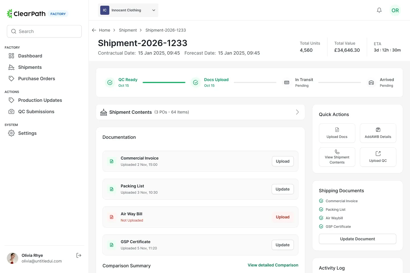
one red row is the whole status
Judgement
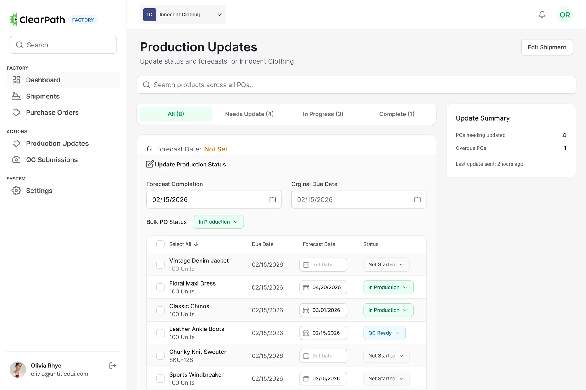
Shipping now is a choice. So show the other one.
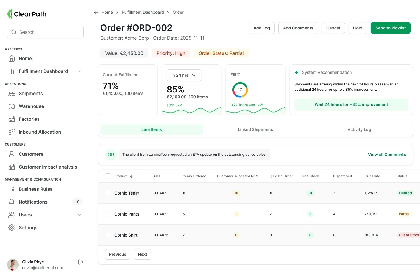
Current fill, a time-scoped projection and a recommendation sit in one row, so waiting is something the operator can weigh rather than something the system simply asks for.
the projection sits beside the advice,
so you can see why waiting pays
Exceptions
The row’s status decides the row’s action.
Expected against received, variance computed as you type. Surplus offers to allocate, shortage offers to log an issue, matched offers nothing — the table routes the exception instead of flagging it.
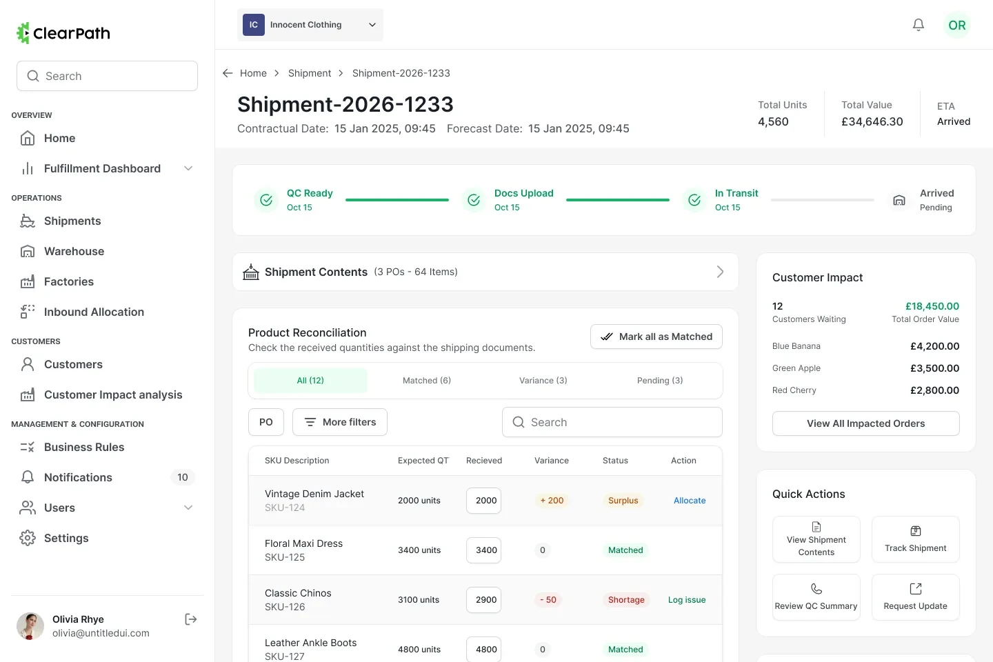
one table, three outcomes, three different buttons
Underneath
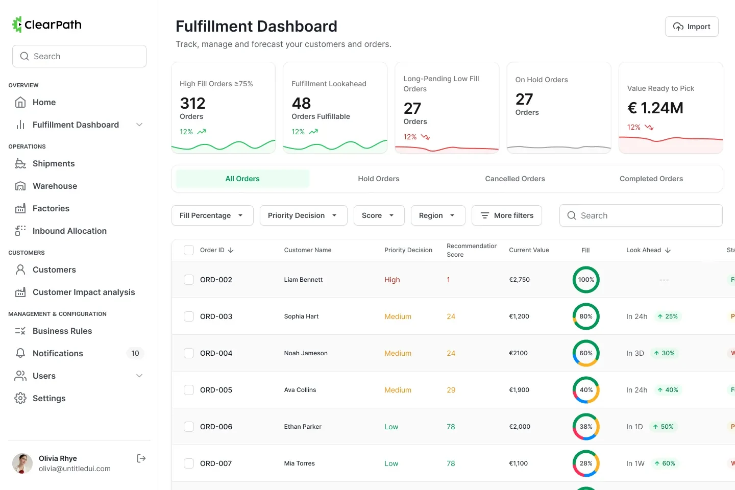
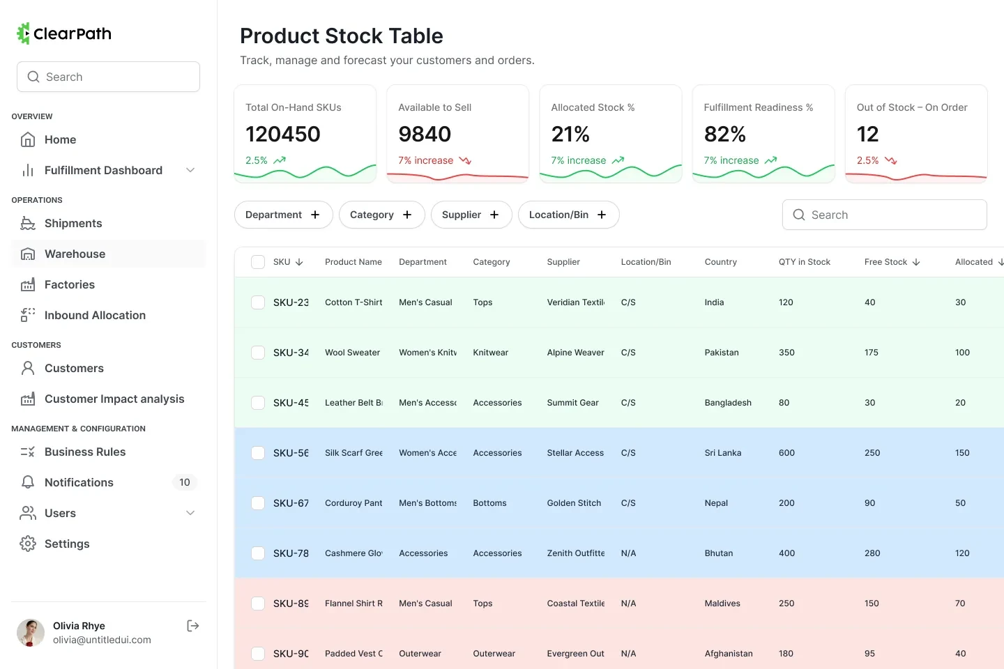
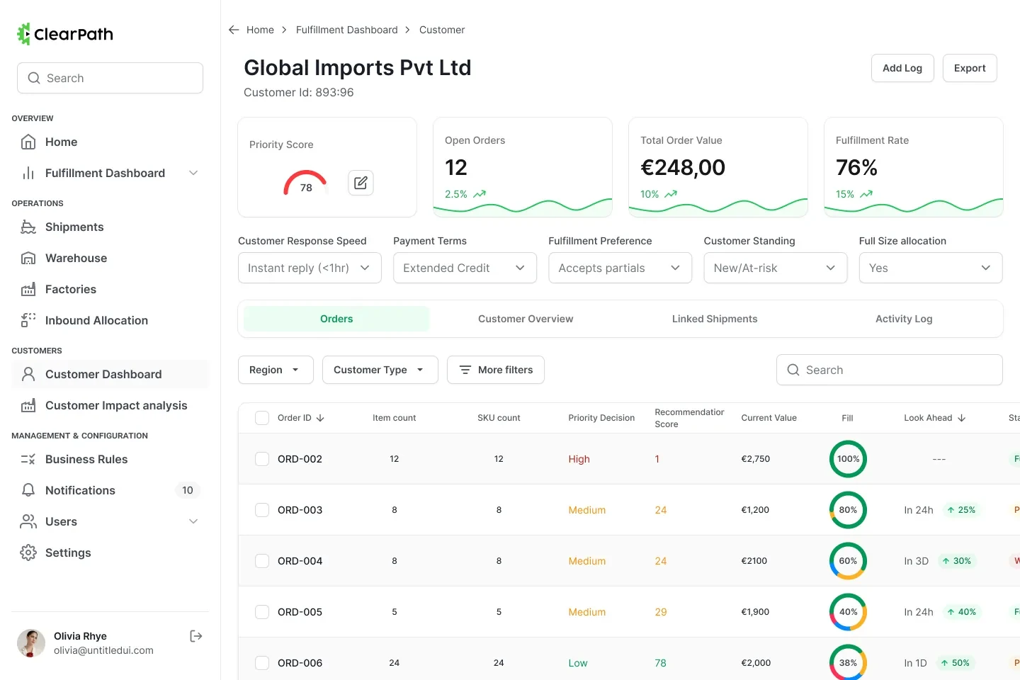
Stock and customers are the same question, asked twice.
What is free to promise, and who has earned it first. So the warehouse table bands rows by stock health with additive filters, and every customer carries a priority gauge and a fill rate next to their open orders.
The decision I’d defend
The priority score is not a black box.
Every ranking in the product comes from weights an ops lead can see and change — response speed, payment terms, flexibility, standing. Arguing with a number beats filing a ticket about it.
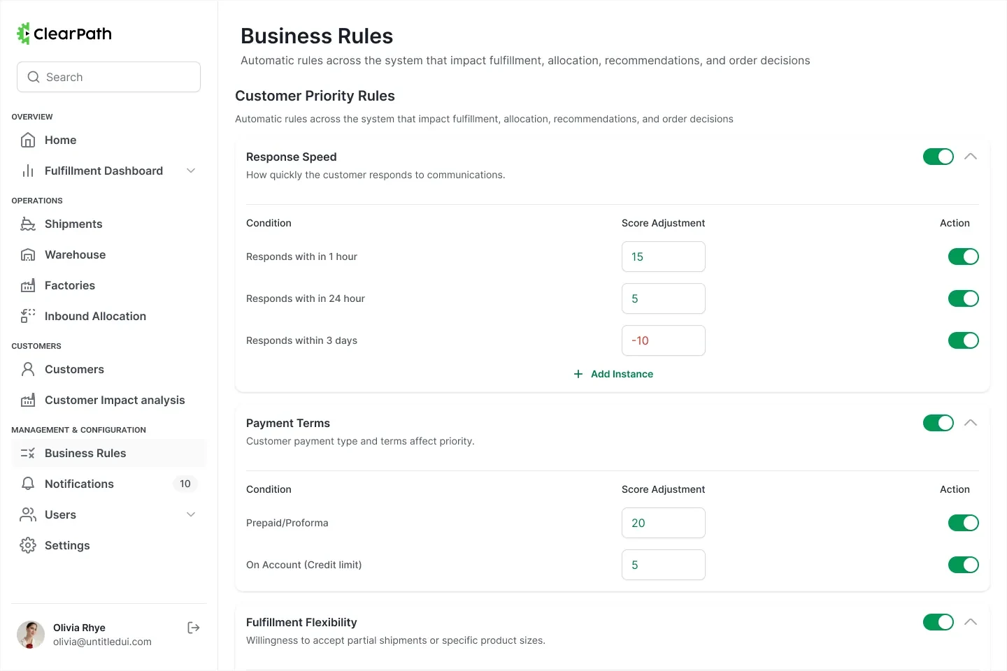
the weights that rank everything else, in one editable list
Impact
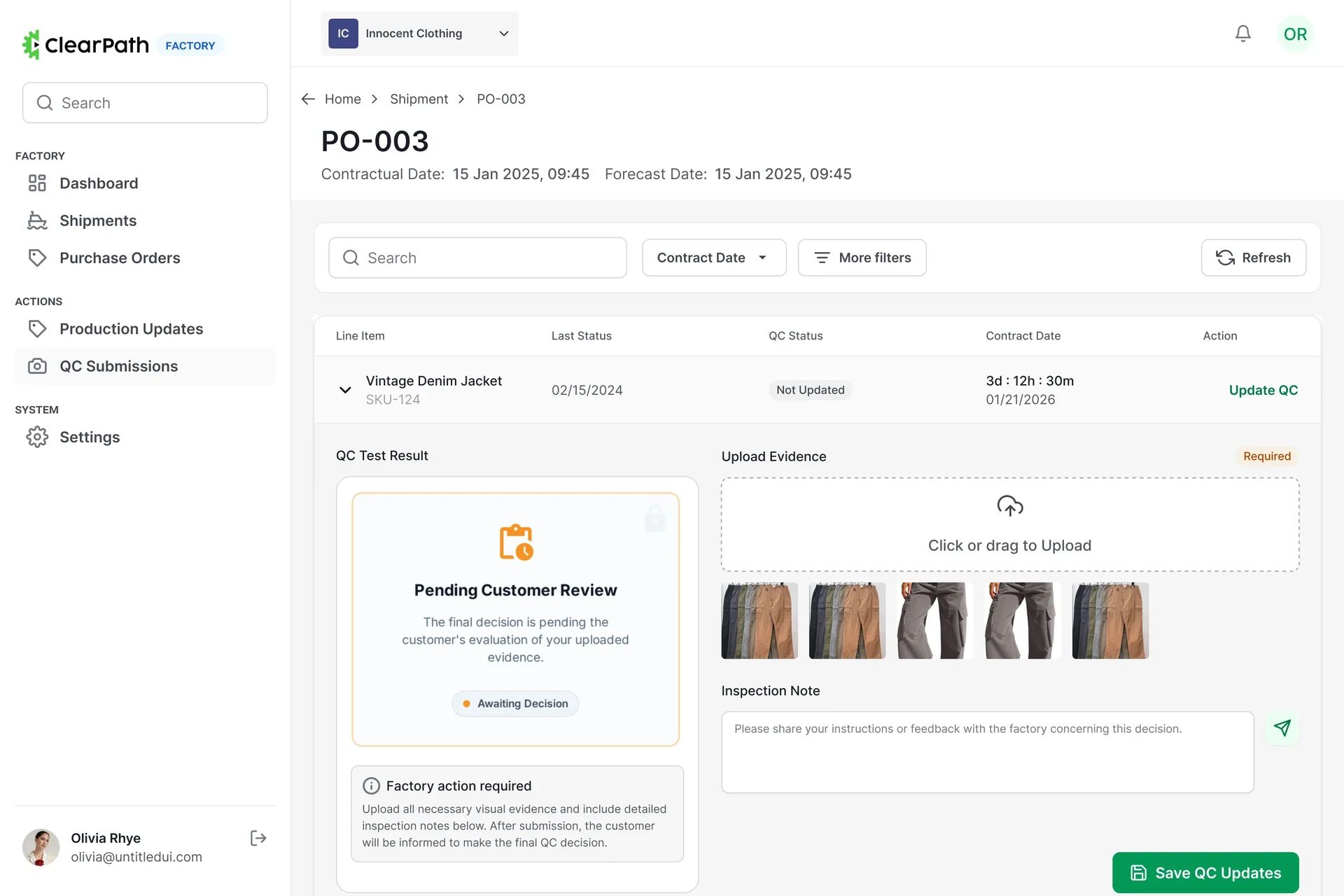
One record, two responsibilities, no ambiguity about whose turn it is.
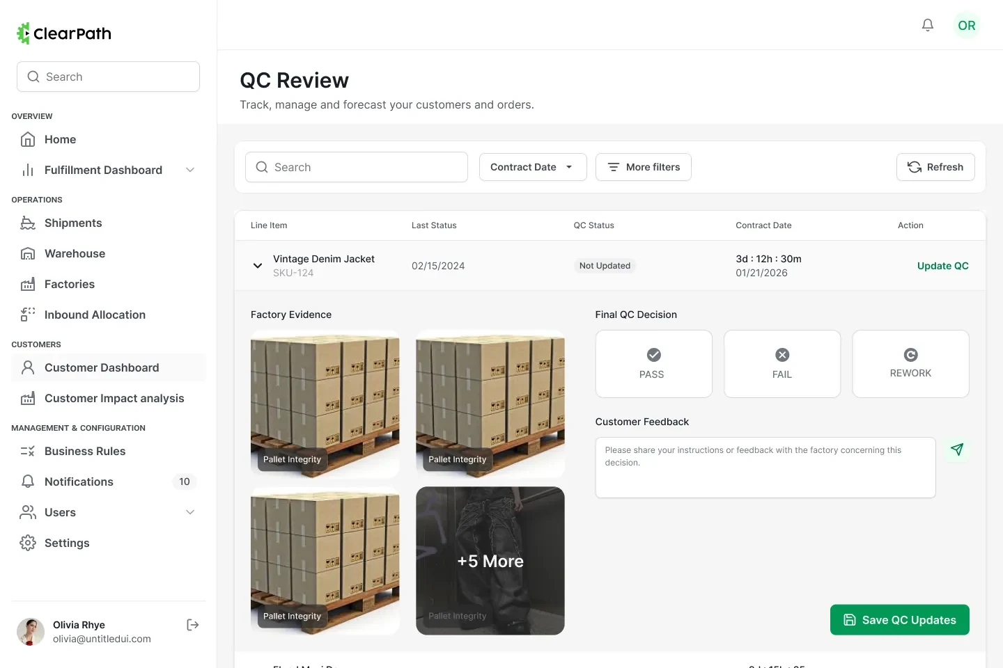
The factory uploads the evidence and the panel locks. The buyer gets a live three-way decision. Nobody chases a WhatsApp thread to find out which of those two things is true.
What this taught me
On a two-sided tool, the hardest thing to design is the handover.
Both sides were happy to do their part. What broke was the gap between them — so the interface had to name the owner before it showed anybody a number.