UX & Product Design · 2024–2026
OCCSDesigning the Screen 1,000 Clerks Stare at All Day
View live product- 1000+clerks
- 300+projects
- 5000+calls at a time
Tl;DR
A multi-tenant call centre used by 1000+ clerks. I redesigned everything they touch.
OCCS replaced VCC, the old system, and is much simpler to use. From sign-in to hang-up the rule was simple: everything needed during a live call on one screen, and out of the way the rest of the time.
Problem
A clerk on a live call cannot go looking for things.
Someone is talking. The script, the customer record, the rules, the result code — all of it is needed now. Every tab switch happens in front of a caller.
My role
One clerk, many client companies.
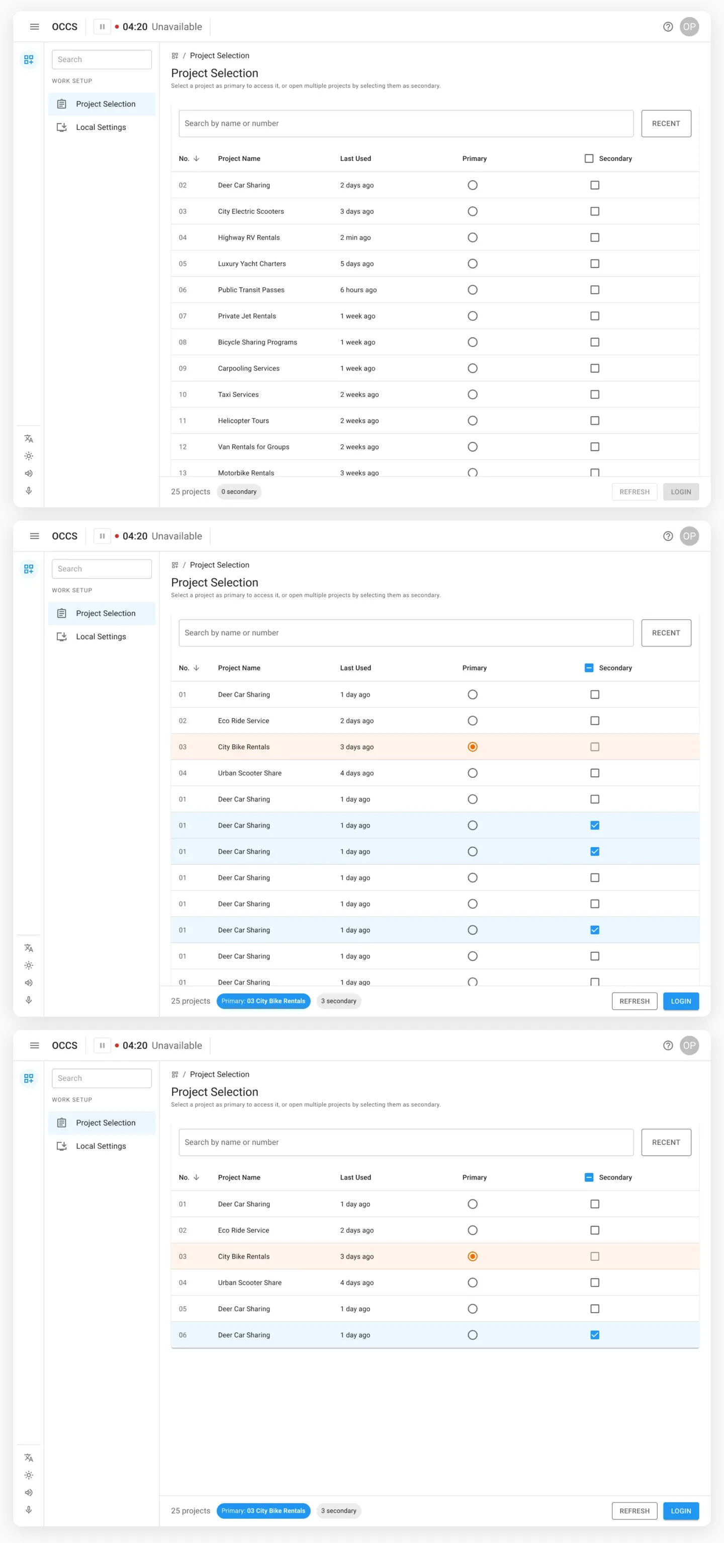
Clerks answer for several businesses at once. One project is primary and loads the script, guide and result codes; the rest stack as reference. Orange is live, blue is on hand.
Design · Sign in
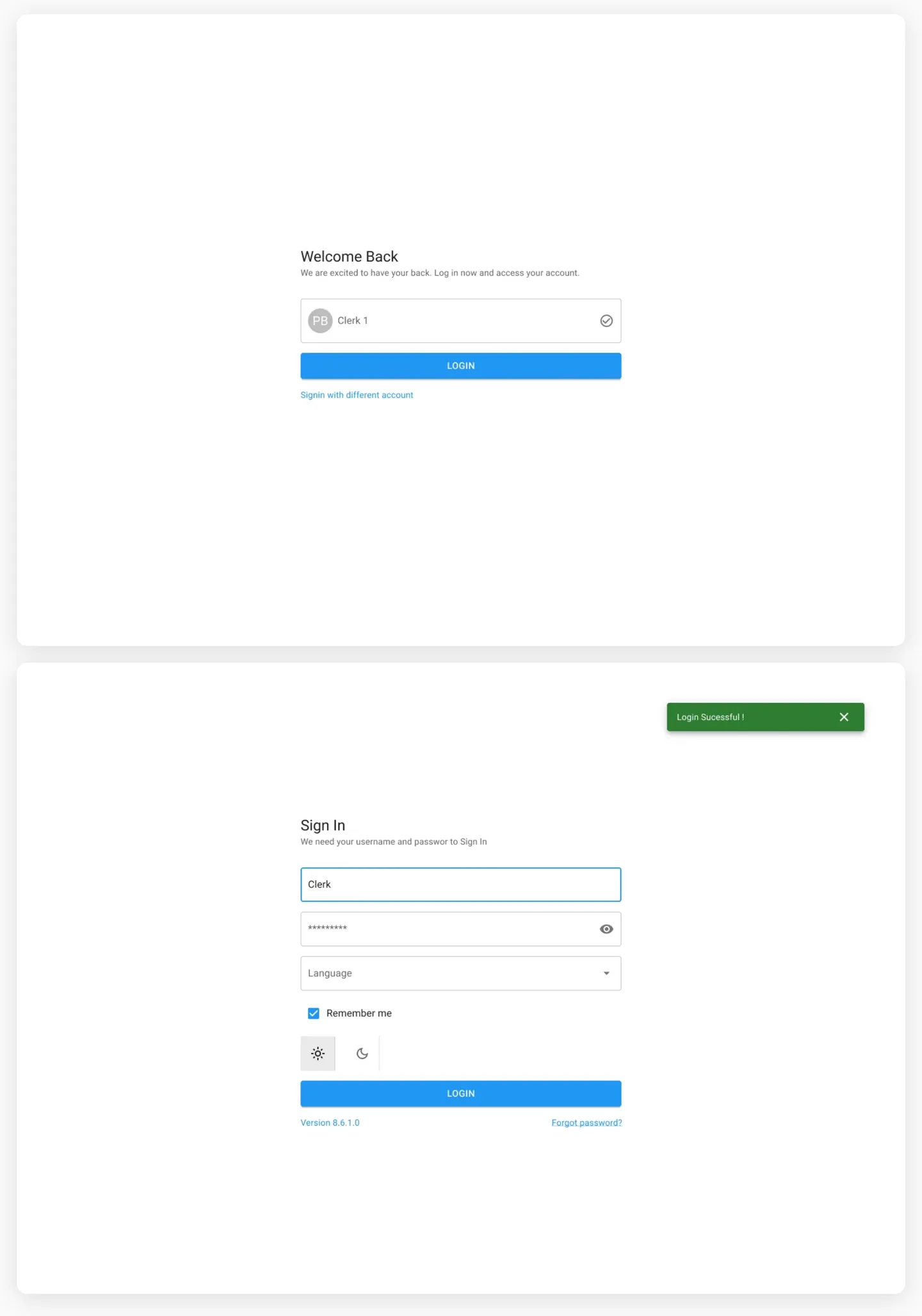
First login or returning clerk — two states, no dead ends.
Sign In collects username, password, and language upfront. Dark/light toggle is accessible before logging in. Returning clerks see a Welcome Back screen with their account pre-loaded — one tap to get in, one link to switch accounts.
Design · Project selection
Pick your primary project, stack secondaries — then go live.
Clerks work across multiple client companies. One project is Primary — it loads the call form, guide, and result codes. Any number can be Secondary for reference. The list is searchable and sortable by last used. Selected primary highlights orange, secondaries blue. The status bar at the bottom shows what’s active before hitting LOGIN.
Design · Audio setup
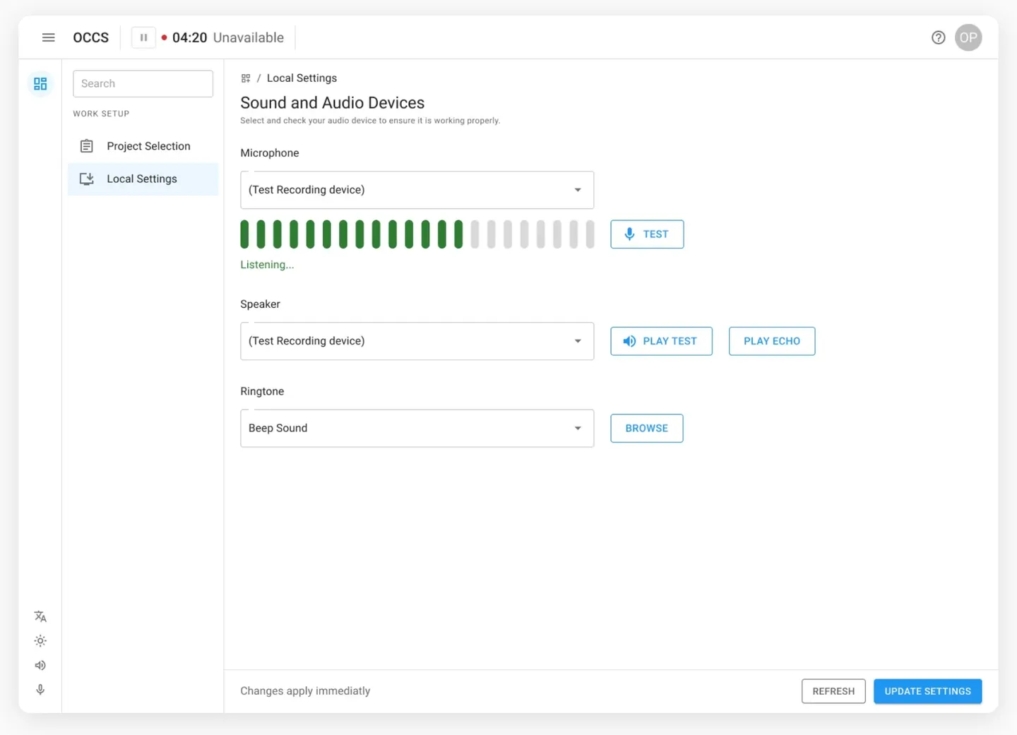
Test your mic, speaker, and ringtone before the first call rings.
Local Settings lets clerks pick their own audio devices independently. Live input meter shows the mic is actually picking up. TEST, PLAY TEST, and PLAY ECHO let them verify both directions. Changes apply instantly — no save step, no IT ticket.
Design · Callbacks
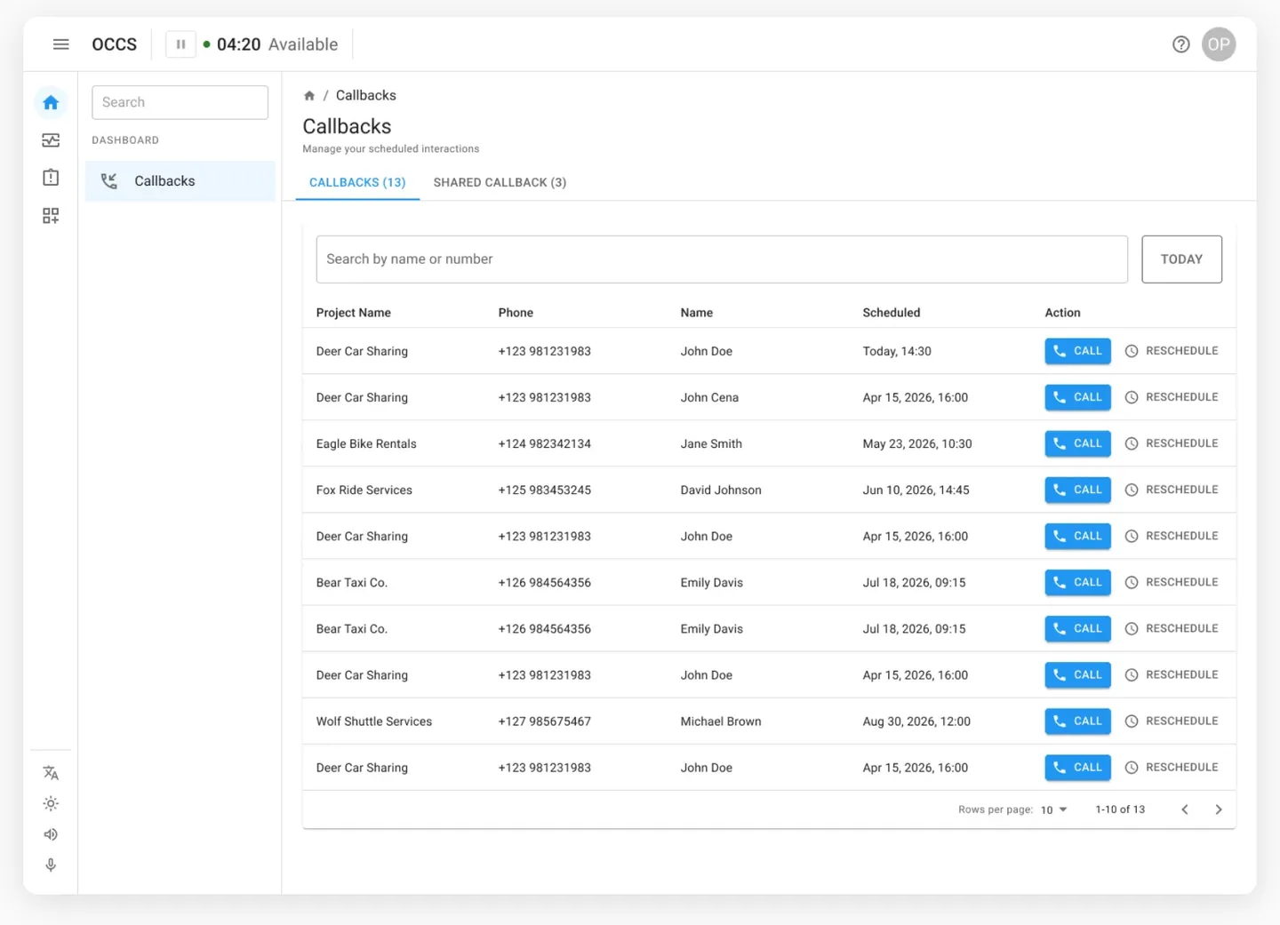
Where clerks live between calls.
The Callbacks dashboard lists every scheduled interaction — project, caller number, customer name, scheduled time — with CALL and RESCHEDULE inline on every row. My Callbacks and Shared Callbacks are tabbed. Search filters by name or number. TODAY shortcut cuts through the noise.
Design · Incoming call
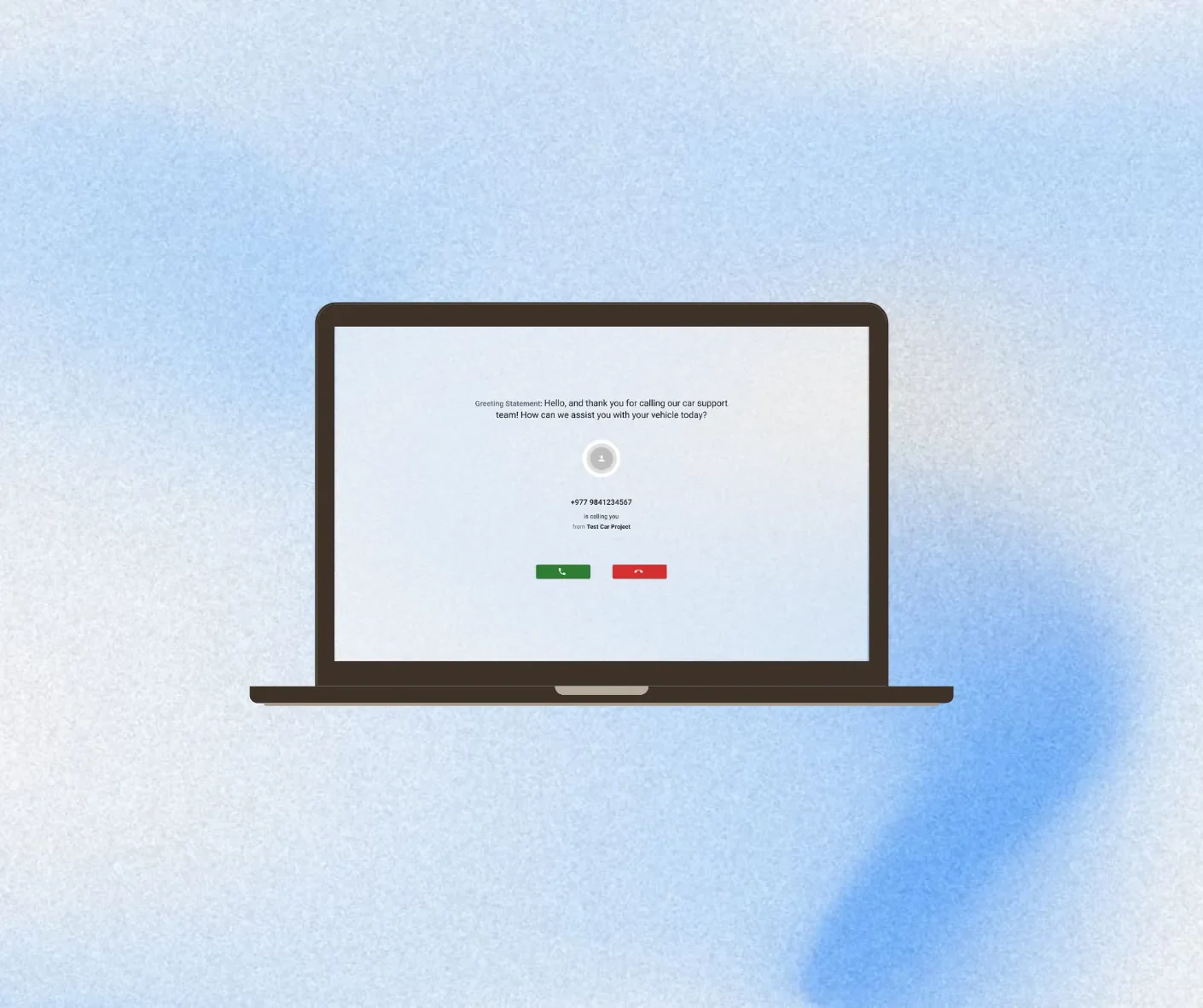
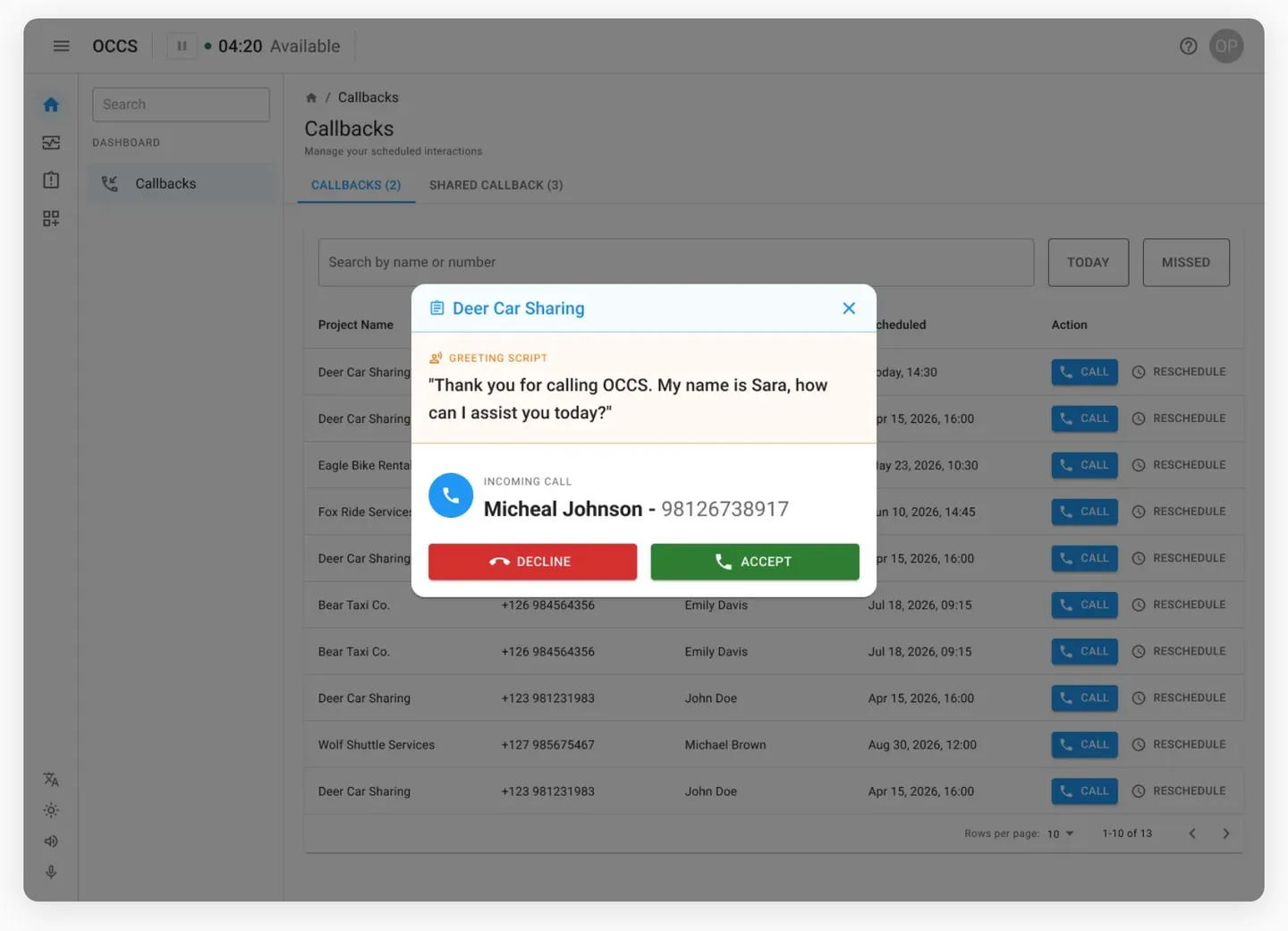
The greeting script shows before the clerk picks up.
When a call comes in, a modal interrupts whatever screen is open. It shows the project, the greeting script the clerk should read, the caller’s name and number, then DECLINE and ACCEPT. The clerk knows exactly what to say before they answer — not after.
Design · Active call
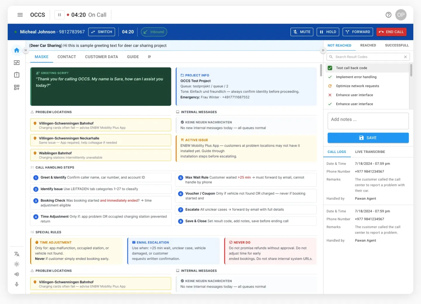
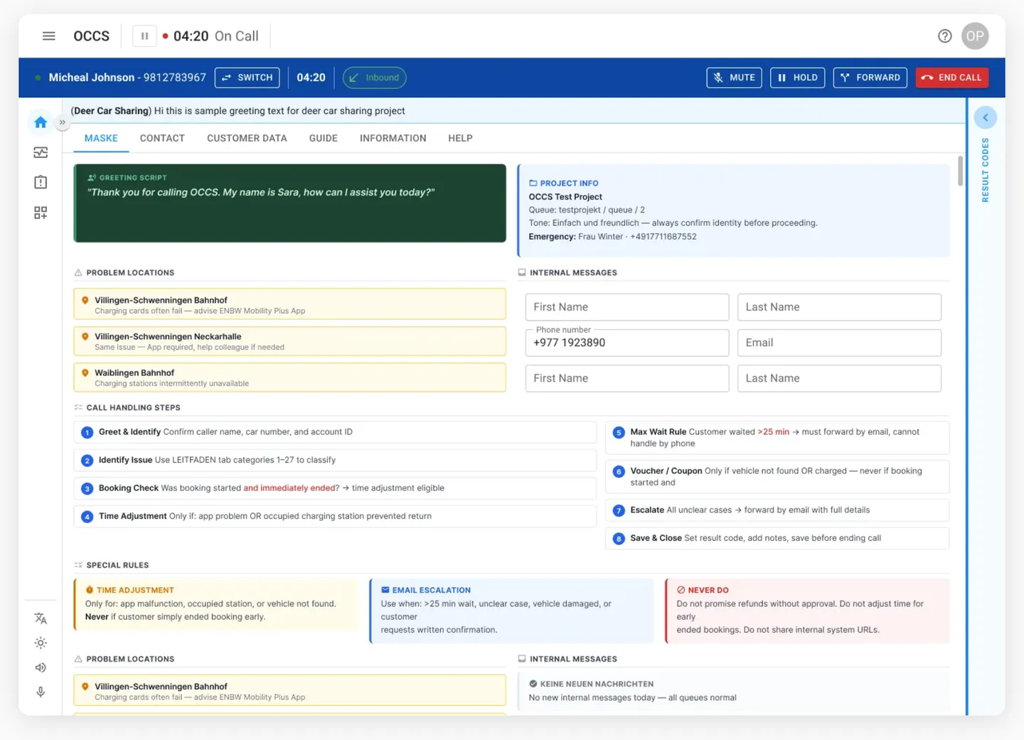
Everything on one screen. No tab switching during a live call.
The call screen is the hardest surface to get right. Left column: greeting script, problem locations with advice, 8 numbered call handling steps, and 3 special rule cards. Centre: live project info and active issues. Right: result codes, notes, Call Logs and Live Transcribe tabs. Top bar: caller name, timer, direction badge, and all call controls — permanent throughout.
Design · Result codes
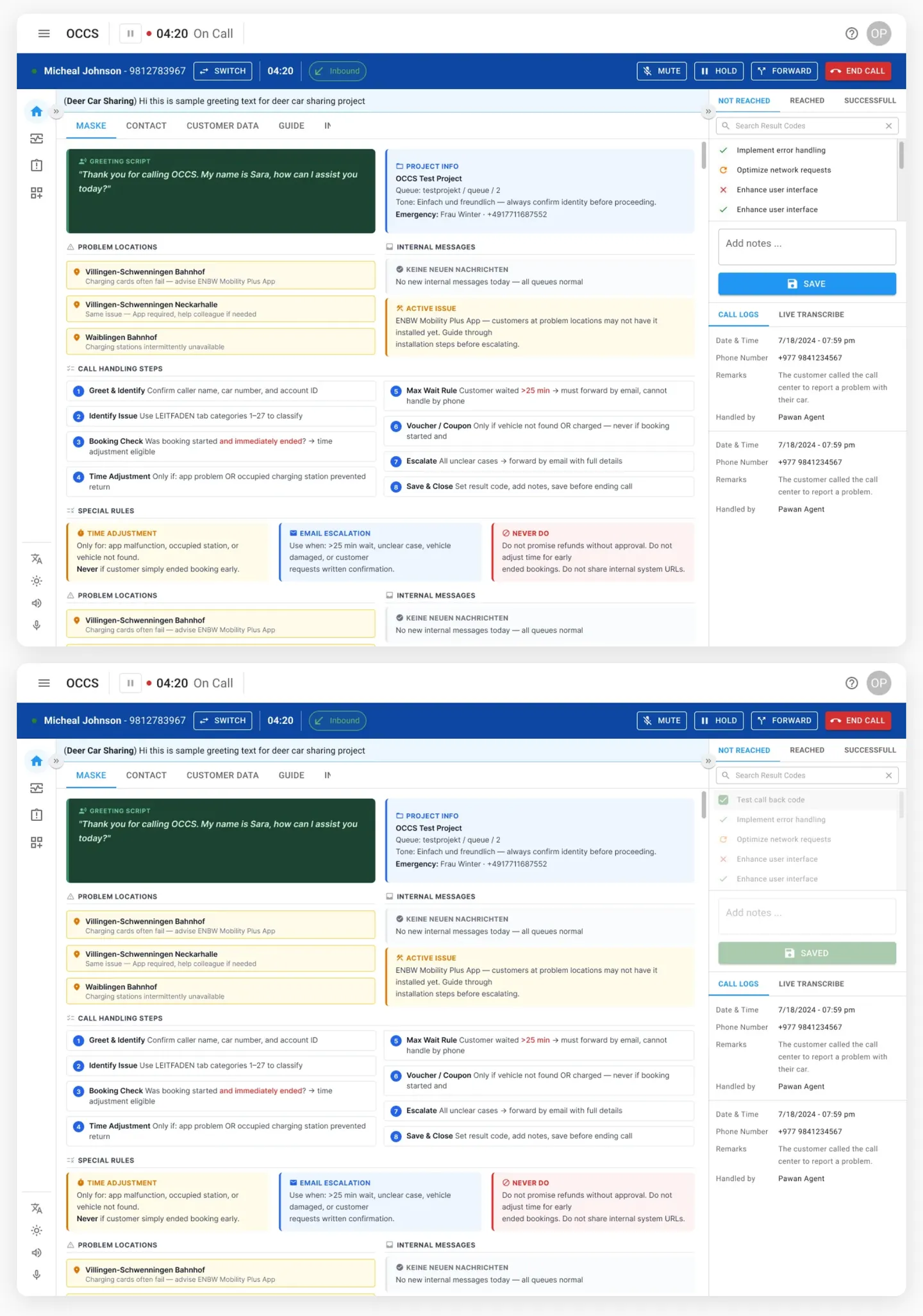
Log the outcome before ending the call — not after.
The right panel has three tabs: Not Reached, Reached, Successful. Clerks pick a result code, add notes, and hit Save. The button confirms SAVED in green. This happens while still on the call — no second screen, no post-call admin.
Design · Focus mode
Collapse both sidebars when the form needs more room.
Both the left nav and right panel collapse independently. When a project has a dense call form, clerks can give the centre content the full width. Expanding either sidebar is one click — nothing is hidden permanently.
Design · Call persists across screens
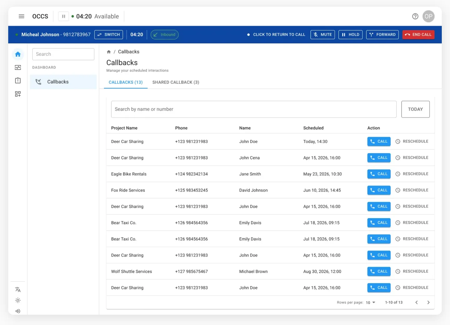
Navigate anywhere during a call — the bar stays.
The blue call bar doesn’t disappear when a clerk opens Callbacks or another module. It locks to the top of every page with the caller name, timer, and all controls. ‘Click to return to call’ appears when they’re away from the call form — one click brings it back.
Design · Minimized call
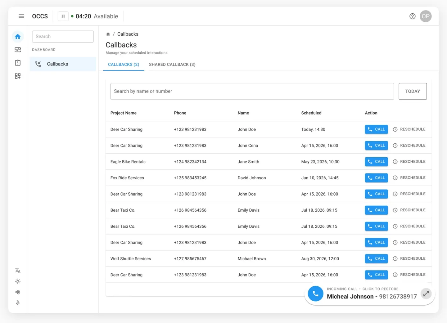
Need both hands free? Shrink the call to a pill.
The active call collapses to a floating pill — caller name, number, expand arrow — sitting in the bottom corner. The rest of the app is fully usable. Clicking the pill restores the full call screen.
Design · Callback during a call
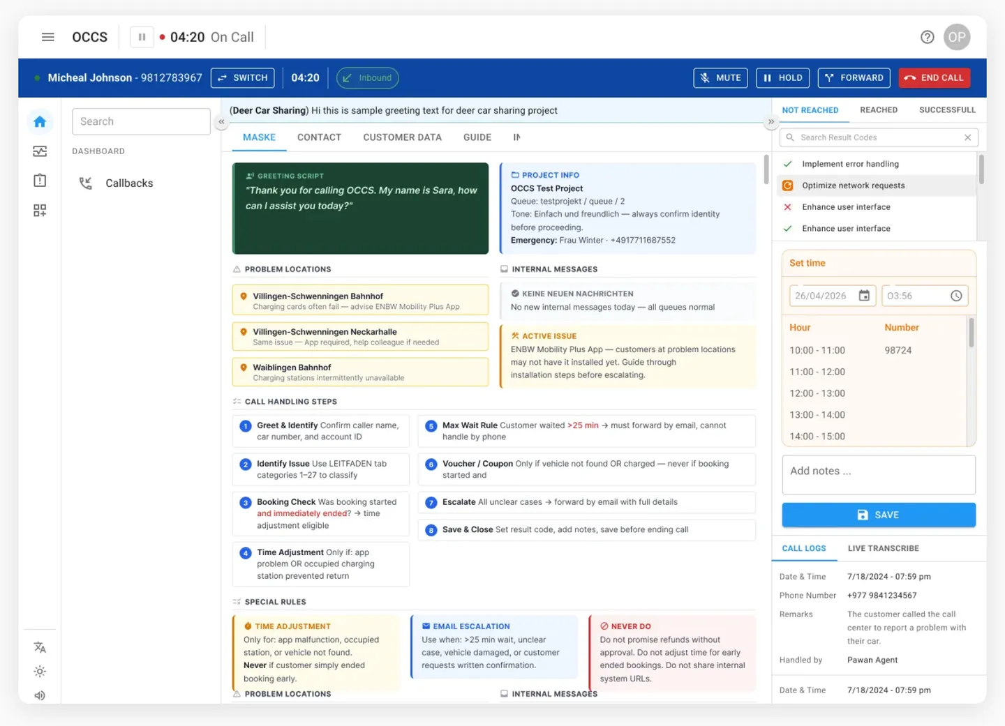
Schedule a callback without dropping the live call.
While on a call, clerks can open the callback scheduler inline. The call continues in the top bar. They pick the time, confirm — done. No modal stack, no context loss.
Design · Call forward
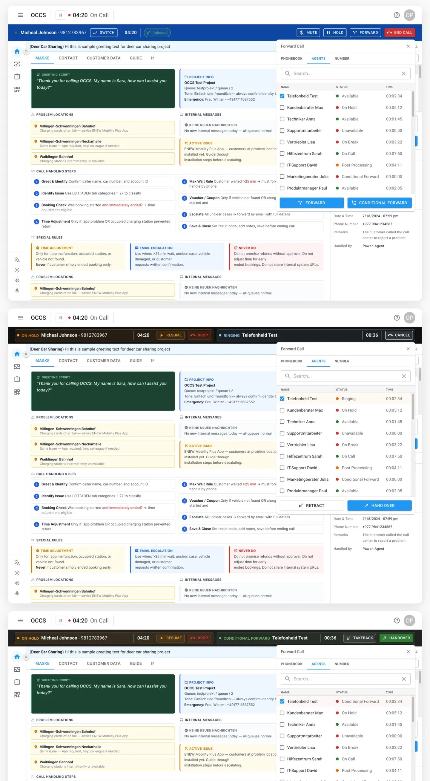
Select an agent, watch it ring, confirm the handoff.
The Forward panel shows every available agent — name, status (Available, On Hold, On Break), wait time. Clerk selects one, hits FORWARD. The row flips to Ringing with a live counter. If the call gets through in conditional mode, the top bar shows both legs of the call simultaneously. CANCEL is always there if the transfer needs to be pulled back.
Design · End call
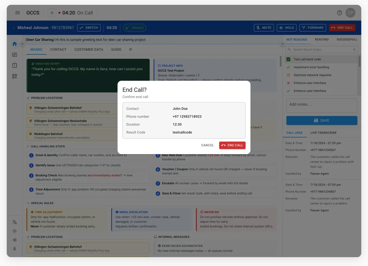
Confirm before you hang up.
Clicking End Call shows a modal with the contact name, number, and result code. Two buttons: CANCEL and END CALL. No accidental disconnects, no fixing a wrong result code after the fact.
Design · Client search
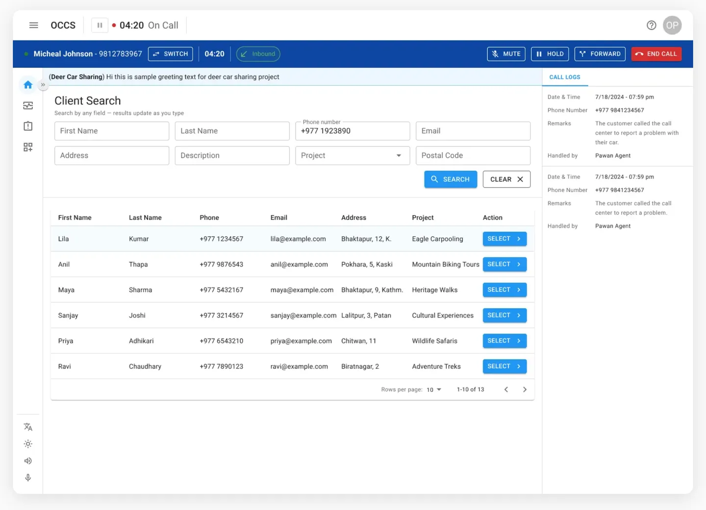
Look up any customer mid-call without losing your place.
Client Search is a tab inside the active call screen. Eight search fields — name, phone, email, address, project, postal code. Results are paginated. SELECT links the record to the call. Call Logs stay visible on the right throughout.
At scale · Process & impact
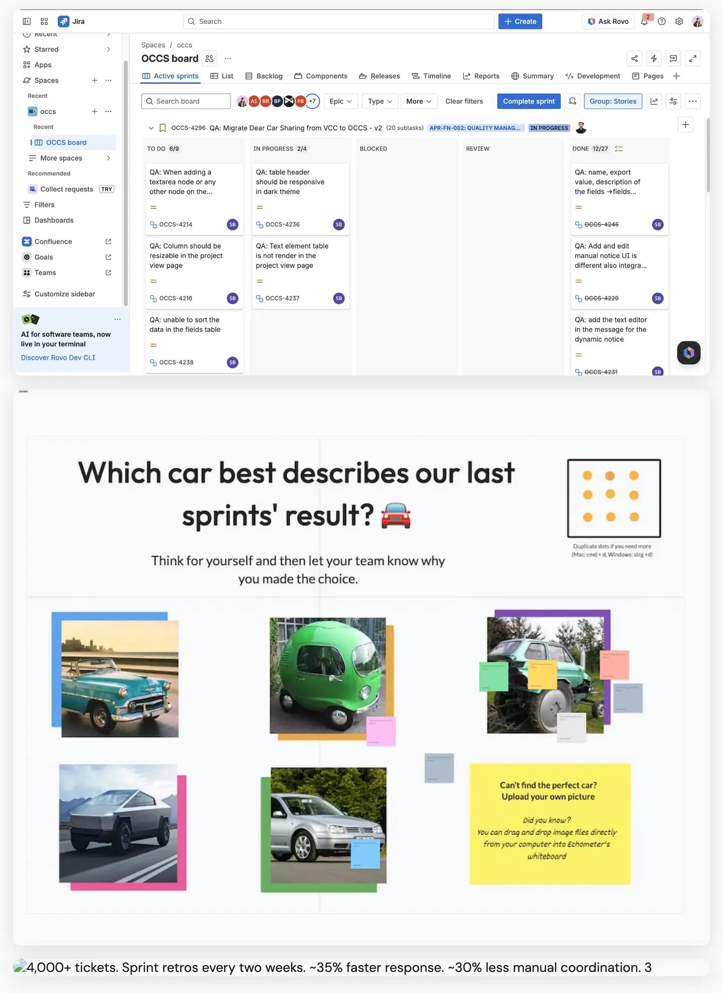
4,000+ tickets. Sprint retros every two weeks.
OCCS wasn’t a side project — it ran live across multiple client companies and thousands of customer interactions. The Jira board shows a real sprint in motion: tickets across To Do, In Progress, Blocked, Review, and Done simultaneously. Every two weeks the team ran structured Miro retrospectives — car metaphors, hunted/hunter formats — to surface blockers and recalibrate.
Impact
Two years, 4,000+ tickets, retros every fortnight.
Shipped continuously with the team rather than handed over in one piece.
- 1000+clerks using it daily
- 4,000+tickets across the programme
- ~35%faster response
- ~30%less manual coordination
What this taught me
Designing for people under pressure is a different job.
No onboarding tour survives a ringing phone. The interface has to be right on the first glance, on the four-thousandth call.