Product Design · April 2026
SkathiDesigning Six Ways to Earn From Music Into One Platform
View live product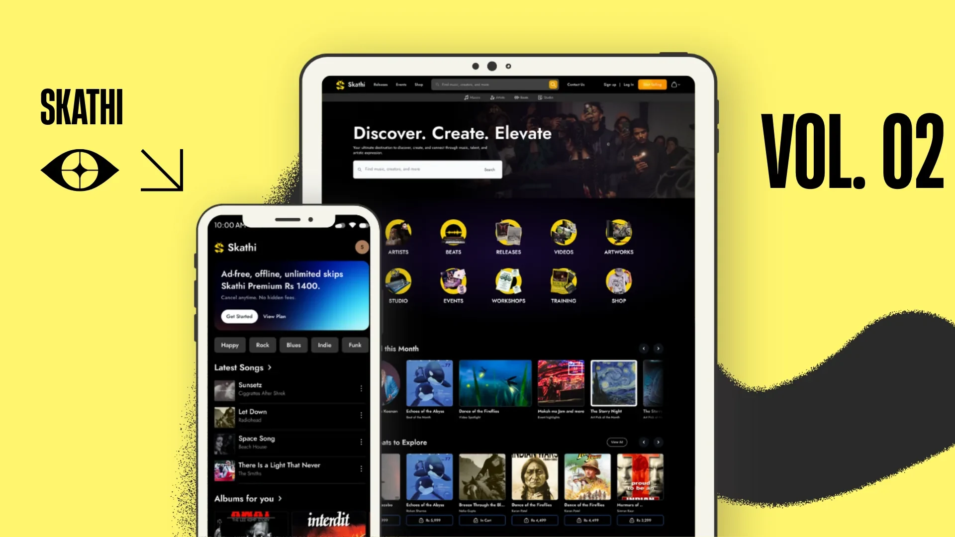
Tl;DR
A streaming app for listeners and a shopfront for the artists.
Streaming, beat licences, artist bookings, tickets, studio hire and merch. I designed the app and the web platform.
Problem
But.. how does a Nepali musician actually get paid?
Streaming pays fractions. The money is in licences, gigs, studio time and shirts — and every one of those lived in a different direct message.
My role
Ten doors on the landing page, not a menu.
Artists, beats, releases, videos, artworks, studio, events, workshops, training, shop. Every surface the platform sells is one click from the top — nothing important hides behind a hamburger.
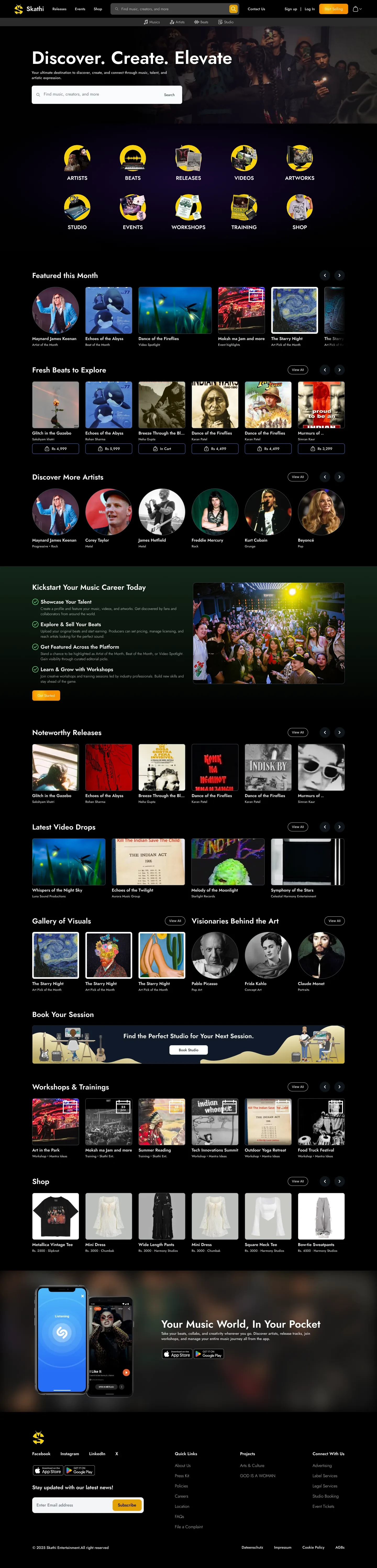
The whole homepage — ten category tiles, then featured releases, beats, artists, videos, studio and merch.
Browsing
A marketplace has to be browsable before it is buyable.
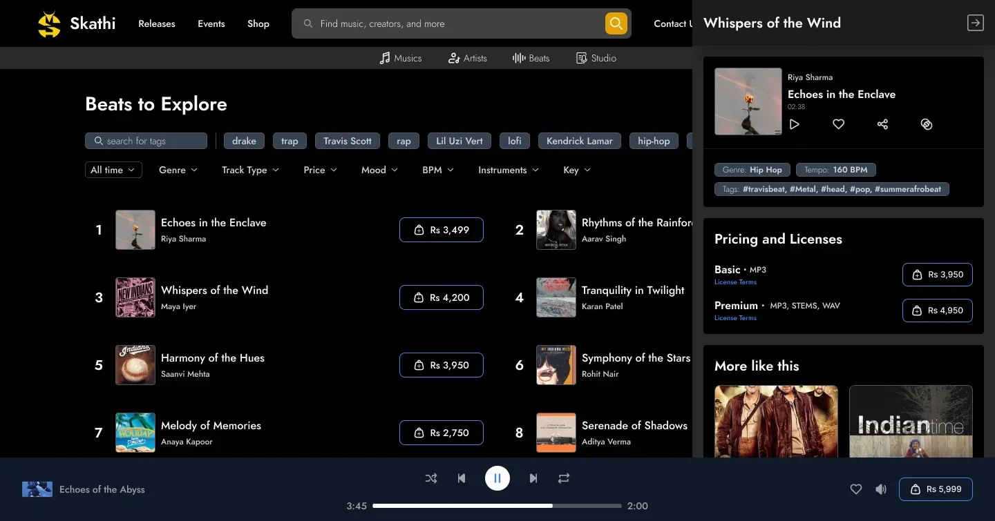
Eight filter dimensions and a tag row, because a producer hunting a beat thinks in key and tempo and mood — not in categories.
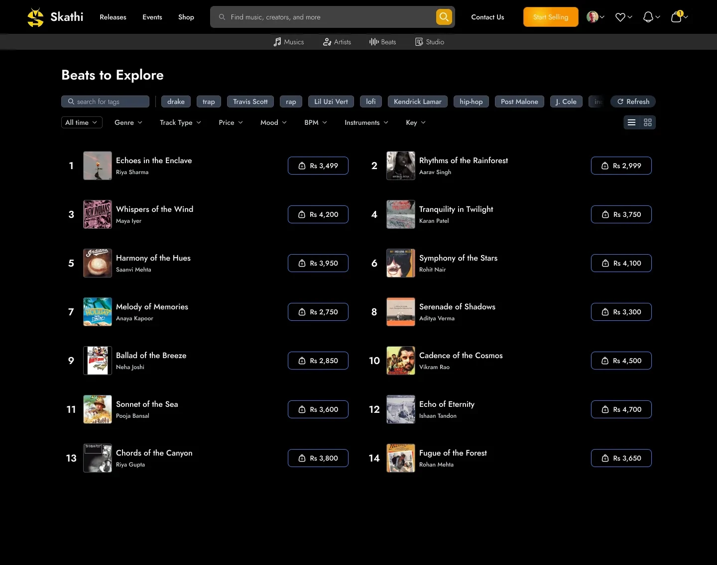
genre, tempo, key and mood — the way a producer already thinks
Buying without leaving
Compare the beat, keep the list.
The detail panel slides in over the results rather than replacing them, so working through a filtered shortlist survives every decision — and the player keeps running underneath it.
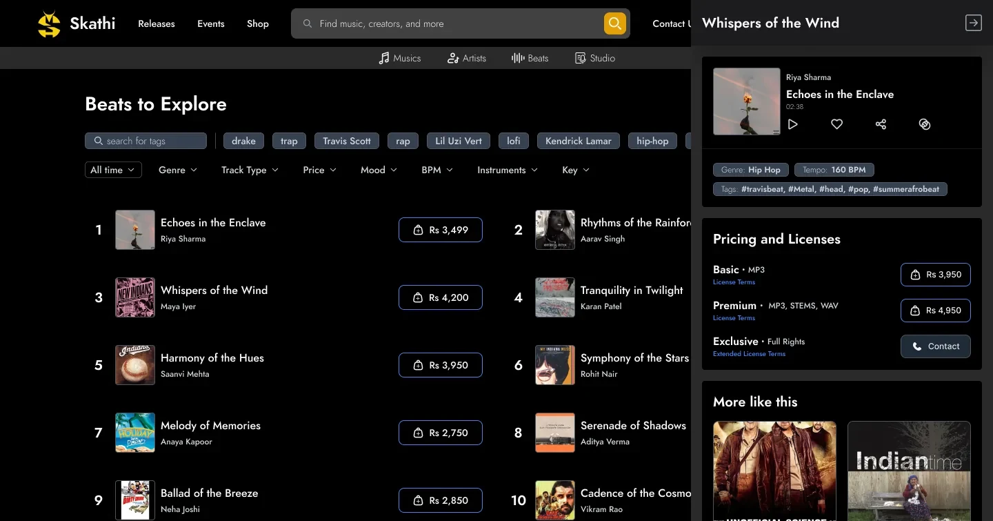
The decision I’d defend
Nobody reads the licence. So stop writing one.
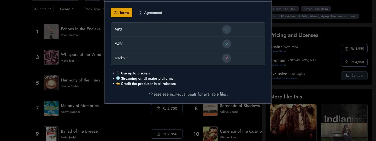
Licence terms became a format matrix and three plain sentences, in a panel rather than a download. What you may do with the track is answerable before you pay, not after.
a tick, a cross, and three sentences —
next to the price it applies to
The artist
One profile. Stream it, book it, buy the shirt.
Popular tracks, discography, upcoming shows, videos and merch are sections of the same scroll rather than five tabs, so a fan who came to listen can leave having bought a ticket.
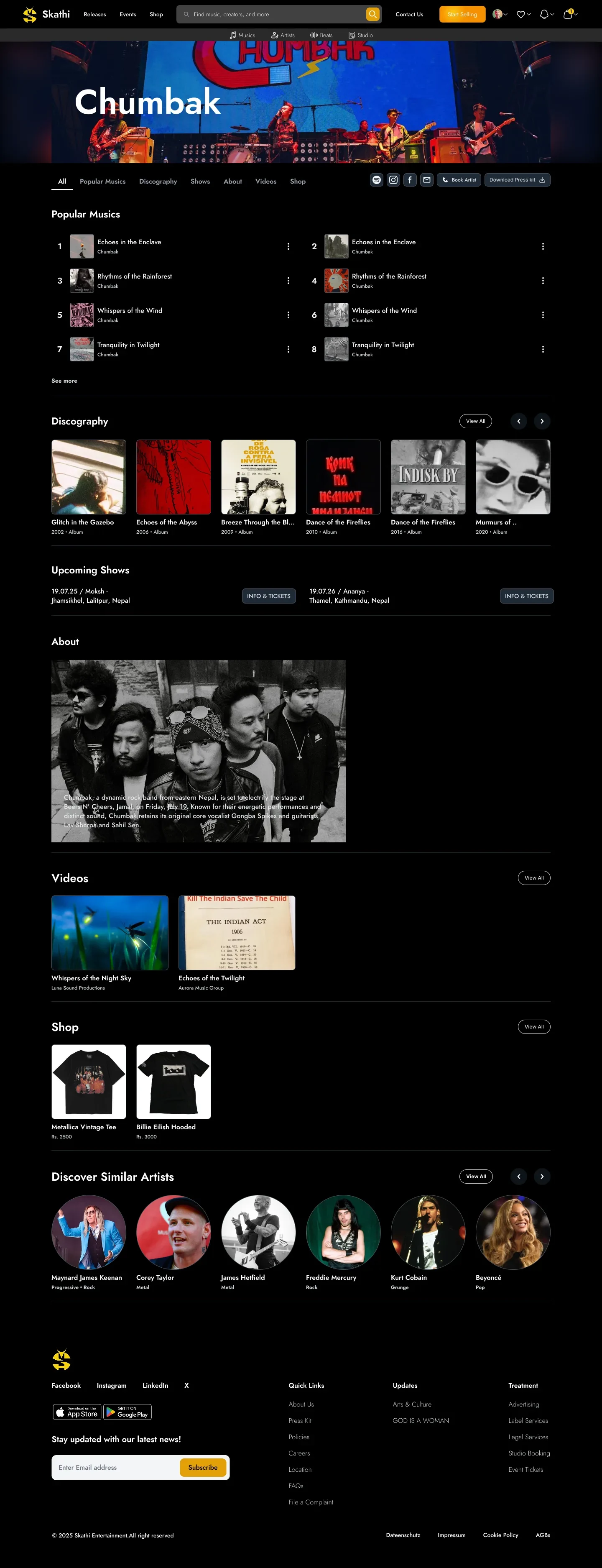
One artist page — music, discography, shows, videos and shop, all on one page.
Booking
Name the next step on the button.
Booking an artist is a brief, not a checkout, so it runs as three labelled steps in one overlay — and the primary button says where it goes, so an organiser always knows how much is left.
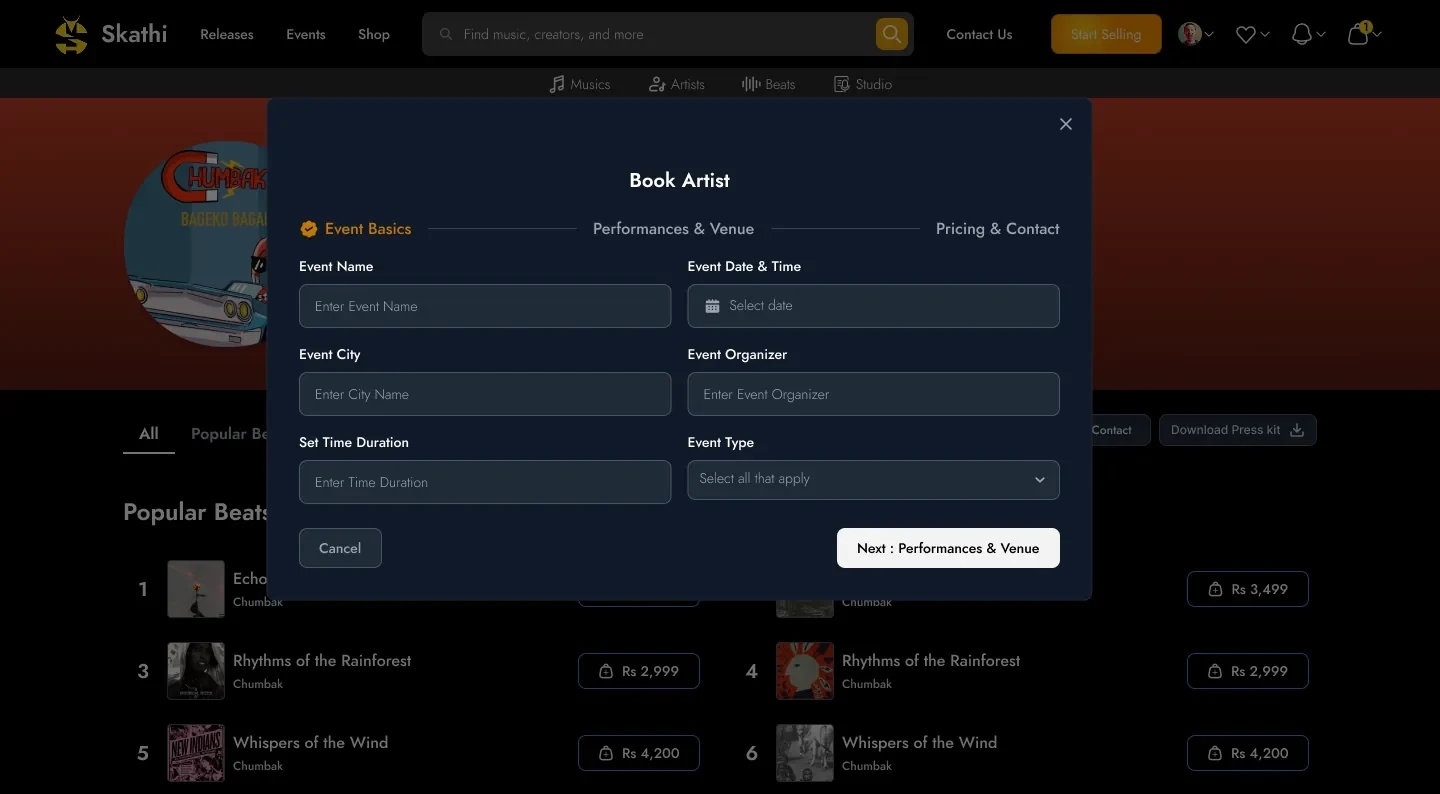
“next” tells you nothing, so the button names the destination
The app
Eight named rows. Nothing unlabelled.
The feed is sectioned rather than algorithmic — latest, albums for you, top picks, trending, fresh releases, charts, playlists, recently played — with genre chips filtering the whole thing from the top.

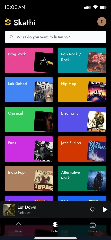
explore by genre
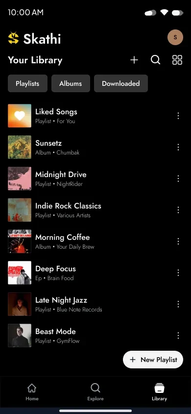
saved, by type
Playback
The artwork picks the palette.
Now Playing takes its colour from the cover, and the queue slides up over it with drag handles — so reordering ten tracks never costs you the thing you are listening to.
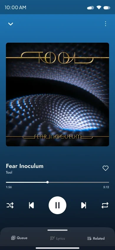
now playing
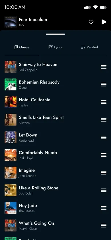
queue, over the top
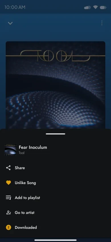
every action, one sheet
Subscribing, and leaving
The value comes before the price. The exit asks why.
A preview carousel and the promise sit above the two plan cards, and the password rules tick off as you type. Cancelling skips the dark patterns and collects a reason instead — an exit is a product signal, not a loss to fight.
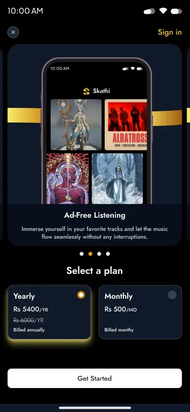
value, then price
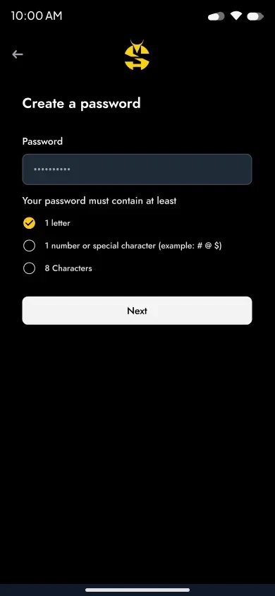
rules tick as you type
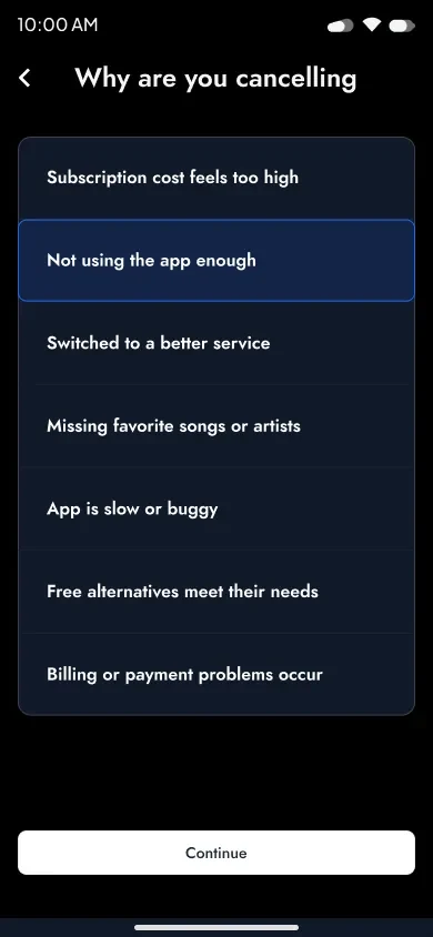
leaving, without a maze
Impact
Four kinds of purchase. One cart.
A beat licence, an album, a t-shirt and a gig ticket are wildly different transactions. Tabbing them inside one cart, under one running total, is what stops the platform feeling like four websites wearing the same logo.
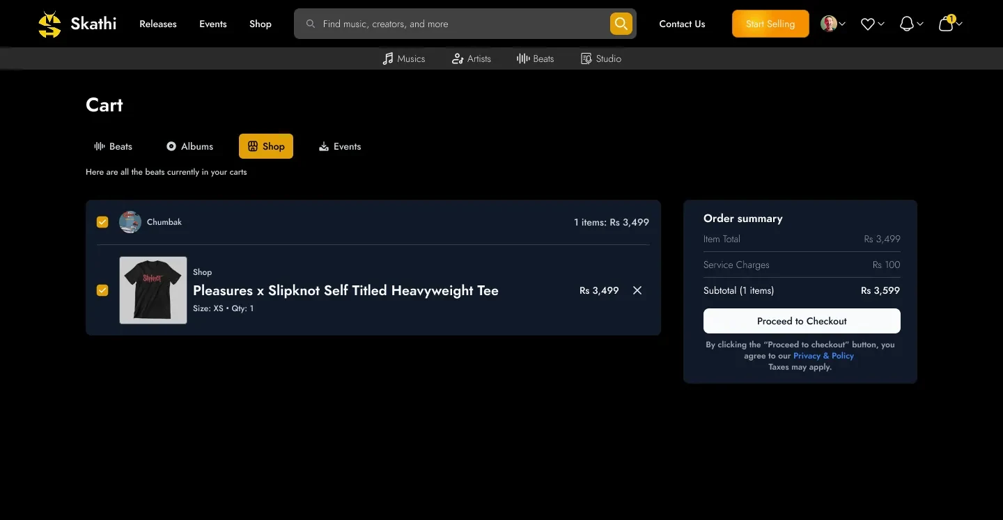
one total, whatever kind of thing you are buying
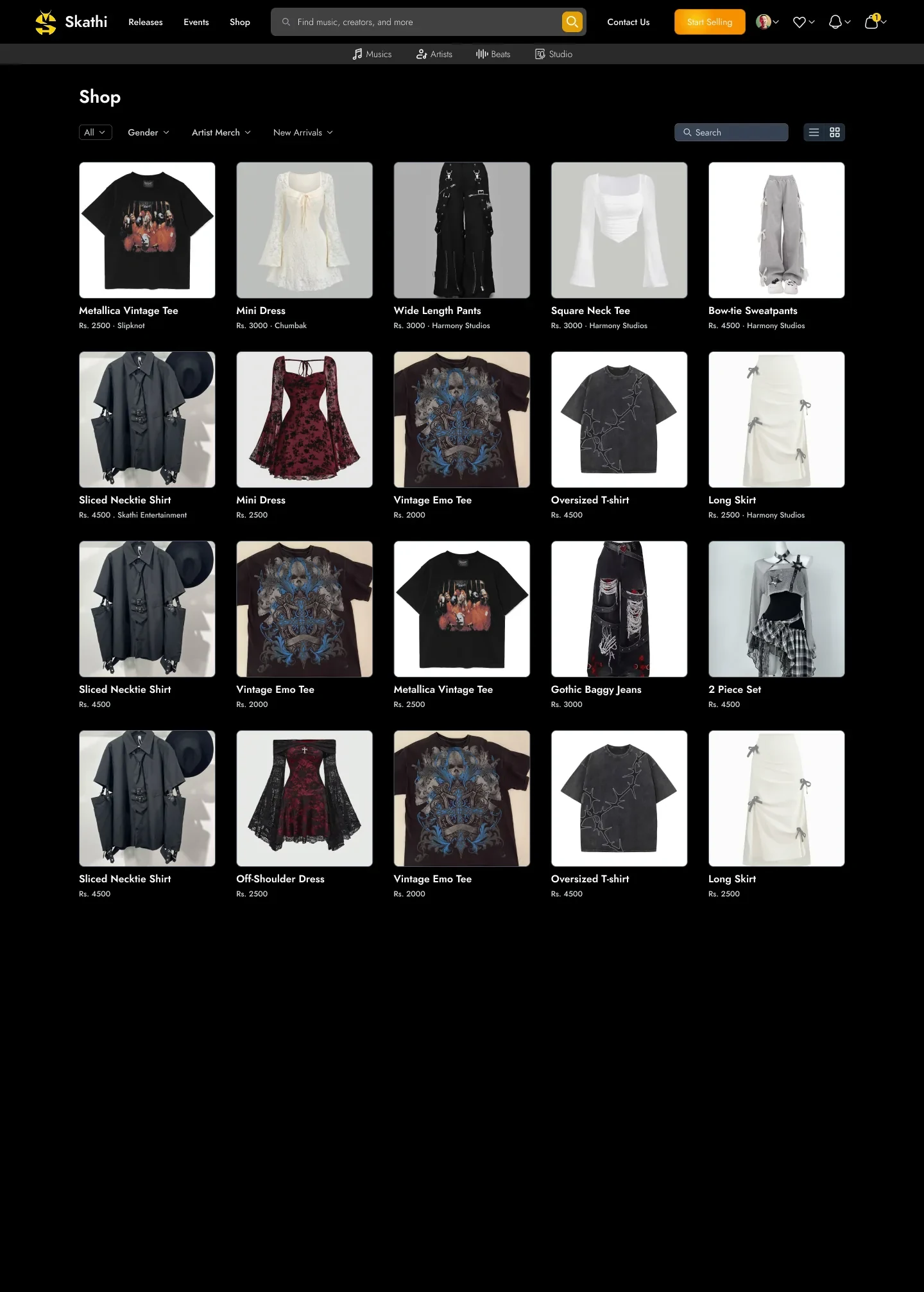
The shop that feeds the fourth cart tab — filterable by gender, artist and new arrivals.
What this taught me
Designing a marketplace means designing for the person selling, too.
Listeners only needed the app to be good. The artists needed a licence someone would actually agree to, and a booking form that did not lose them the gig.