E-commerce · Product Design
HukutRebuilding Nepal’s Gadget Store, One Scroll Depth at a Time
View live product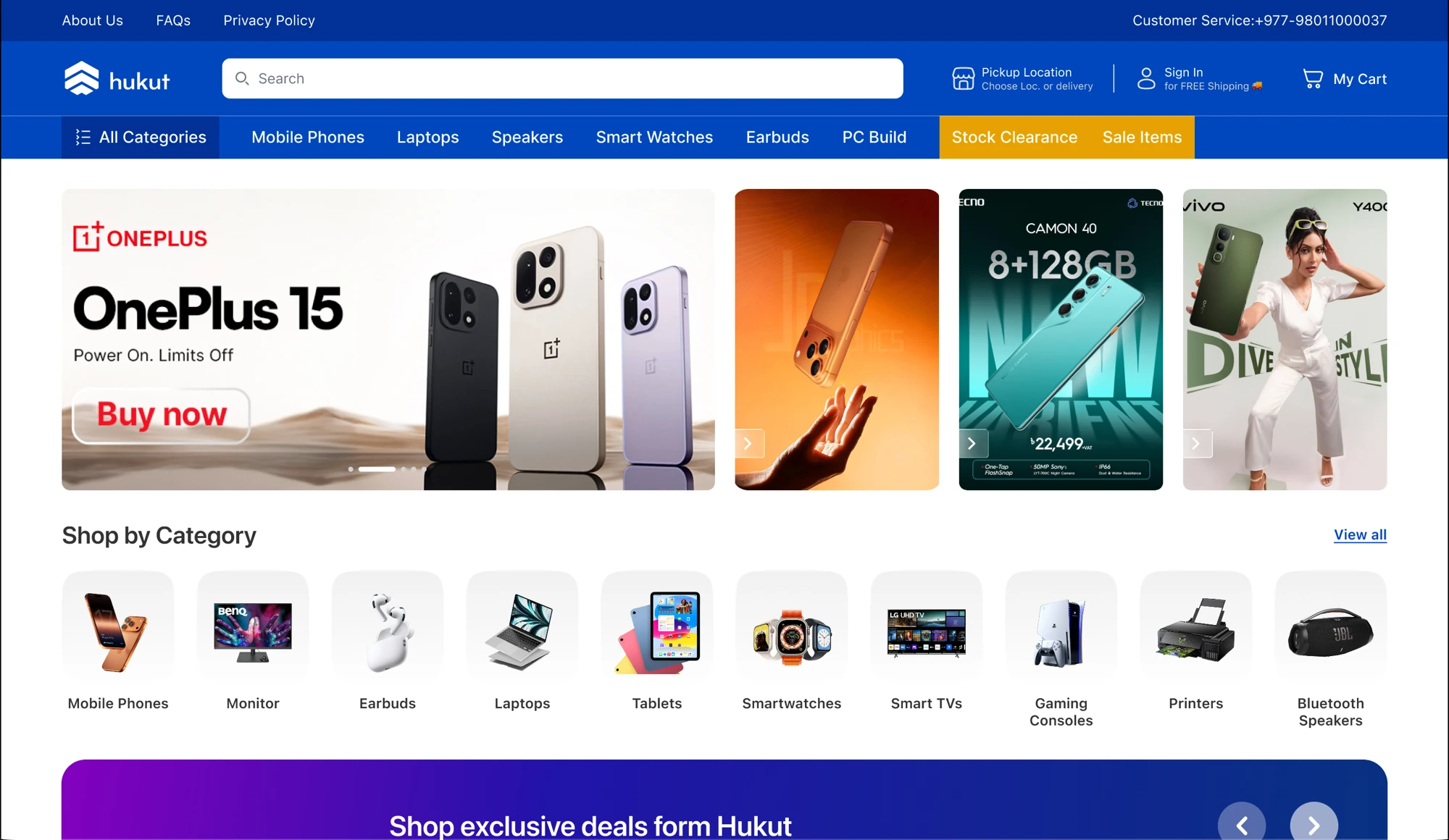
Tl;DR
The traffic was already there. It just didn’t buy anything.
I redesigned the whole storefront. The homepage did most of the work.
Problem
But.. why leave a shop you came to on purpose?
Four products above the fold, then nothing to do. Everything shouted at the same volume — and none of it told you the price was good or the seller could be trusted.
before
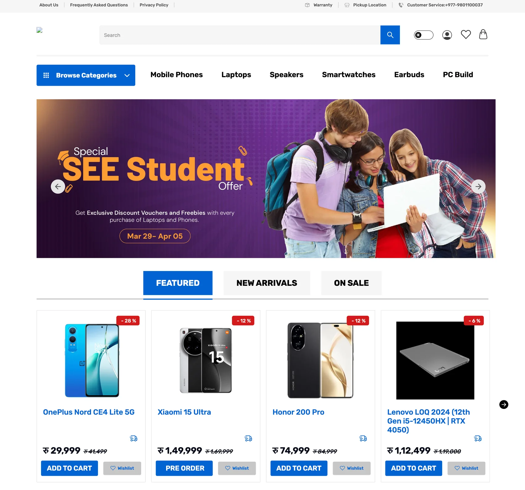
The homepage
A shop window has one job. A homepage has eight.
People land here knowing exactly what they want, or nothing at all, or halfway through deciding. Every band below is aimed at one of those.
8,186pxof homepage — nothing on it is filler
Get out of the way
Search first, categories second. Suggestions and real products appear together, so a shopper who knows the model never sees a category page at all.
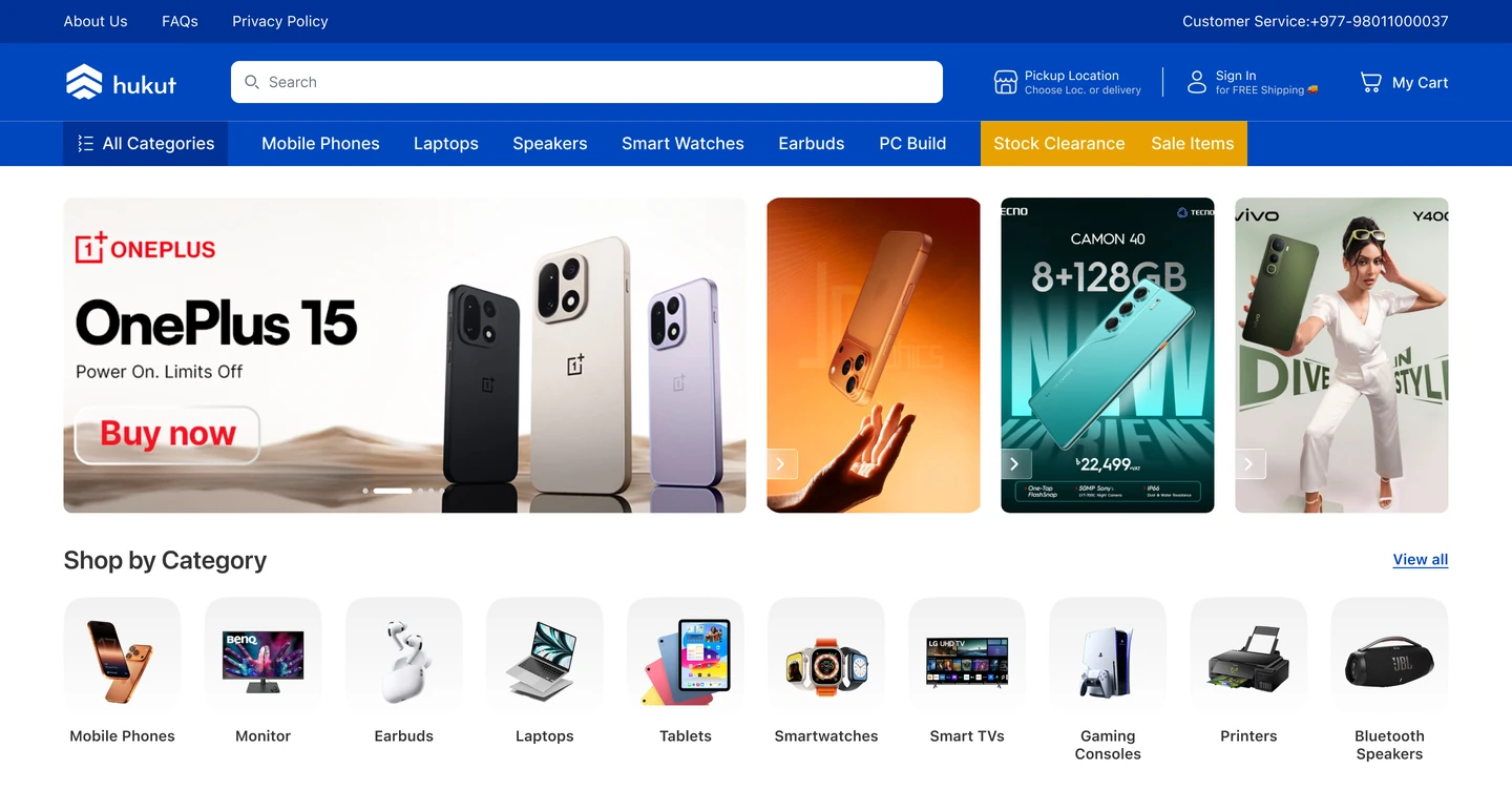
stock clearance and sale sit in the nav, not buried in a menu
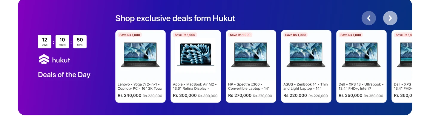
A reason to buy today
A real countdown against real discounts. Urgency only works if it expires.
Pick up where they left off
Most visitors are returning, mid-decision. Showing them their own last search beats showing them a bestseller.
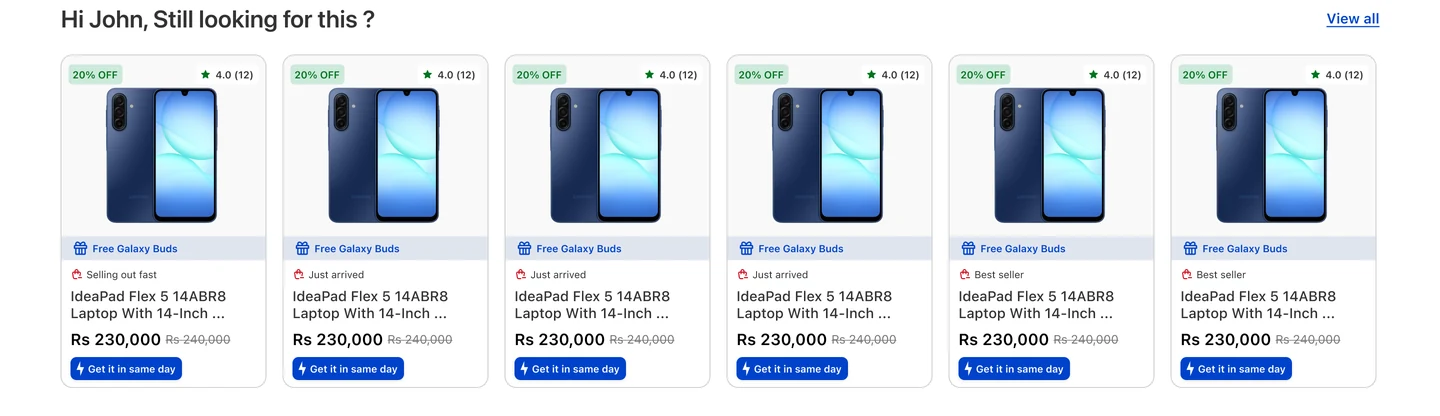
the single highest-intent row on the page
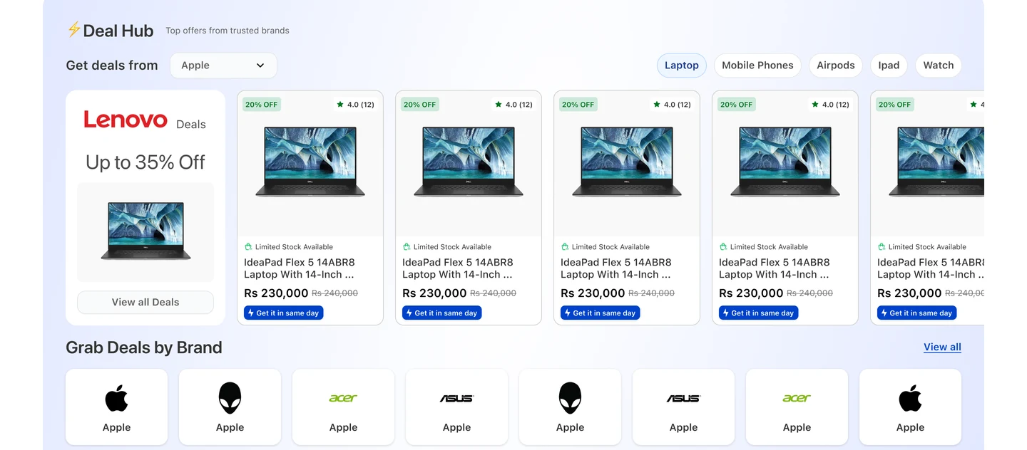
Shop the brand, not the catalogue
In Nepal people buy brands they already trust. The Deal Hub filters by brand and category together, so 'Lenovo laptops on offer' is two clicks.
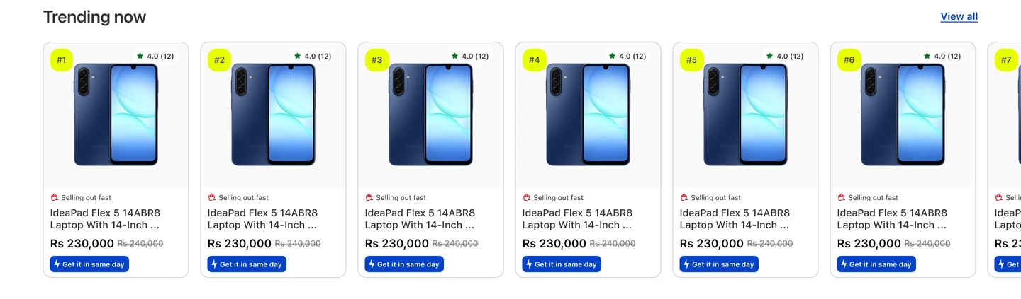
Social proof without asking for it
Ranked, numbered, visibly moving. What other people are buying is the cheapest recommendation engine there is.
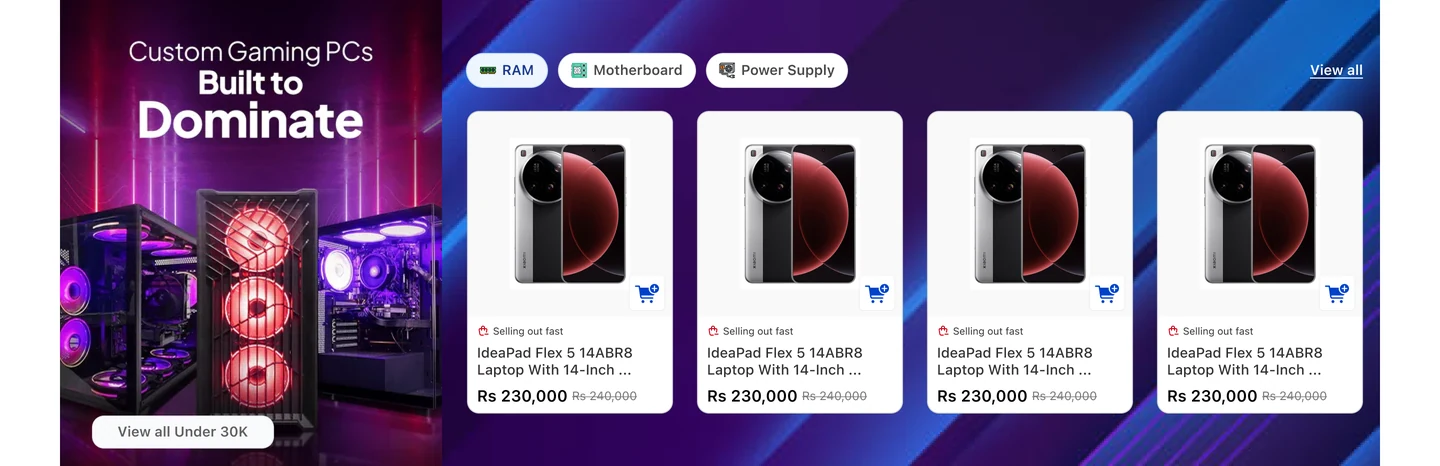
Catch the highest-intent visitor
Someone building a PC is the most valuable person on the site. They get their own configurator entry, not a search box.
Three ways to browse when you don't know
Upcoming for the patient, New Arrivals for the curious, Shop by Use Case for the person who knows the situation but not the product.
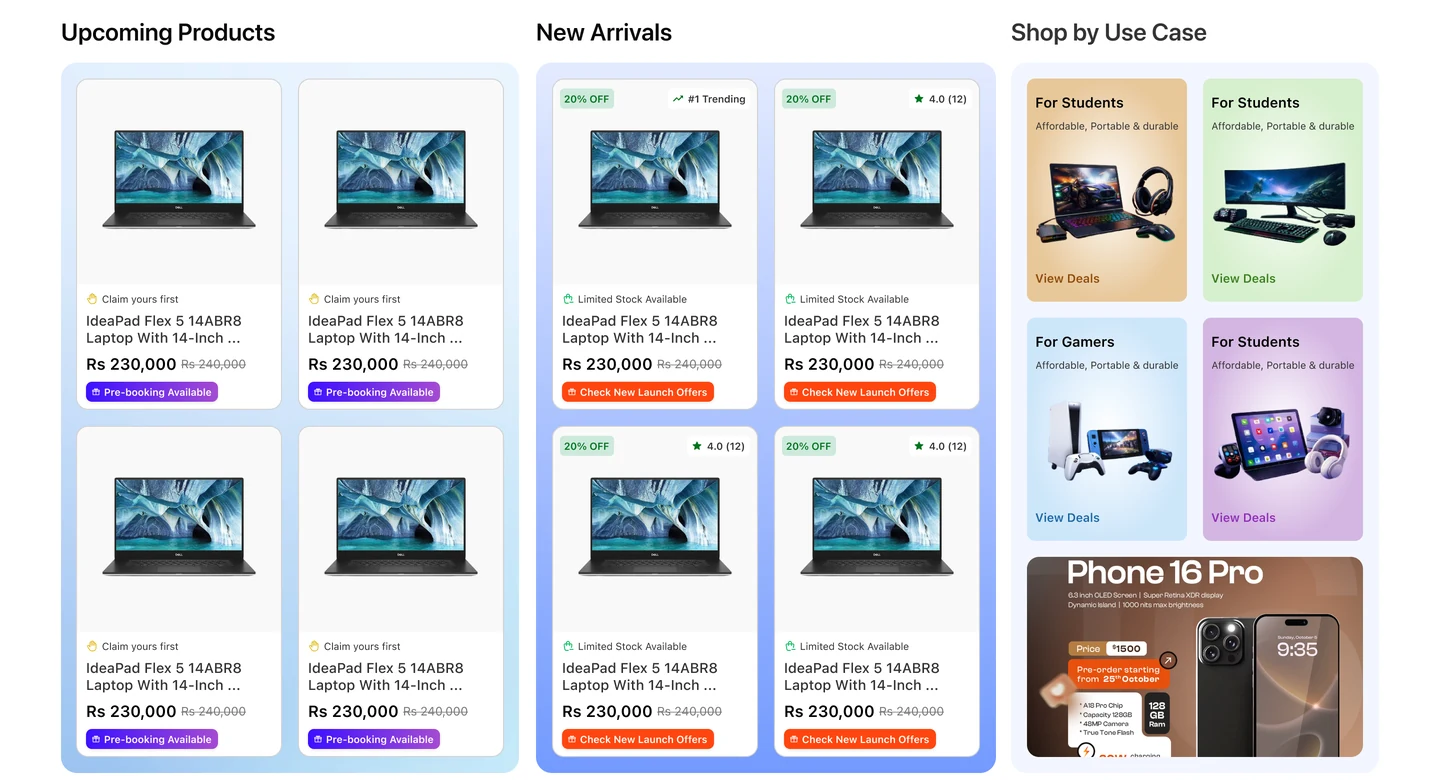
“for students”, “for gamers” — how people actually describe what they need
Answer the question before the sale
Buying guides at the bottom of the page catch the researcher who isn't ready yet — and bring them back through search later.
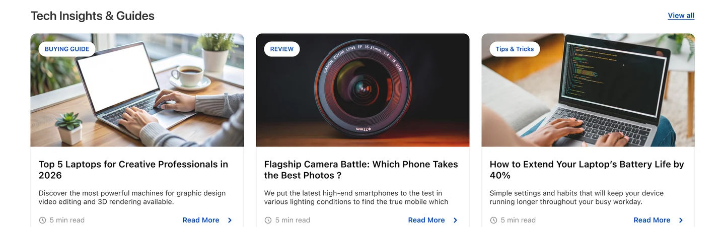
All eight, in one scroll
Now see it whole.
Every band above, in the order a shopper actually meets them.

The full homepage — 8,186px, end to end.
Responsive
Same store. One hand.
Most of Nepal shops on a phone, so this is the real layout, not the fallback. The eight bands become eight swipes — nothing is dropped, the order just gets stricter.


both scroll — they’re the whole pages, not crops
The decision I’d defend
Answer every reason not to buy, before it’s asked.
Genuine product, official warranty, cash on delivery, pickup today, cashback, freebies, the exact variant and its price. Online shopping in Nepal runs on trust, so trust is the product page.
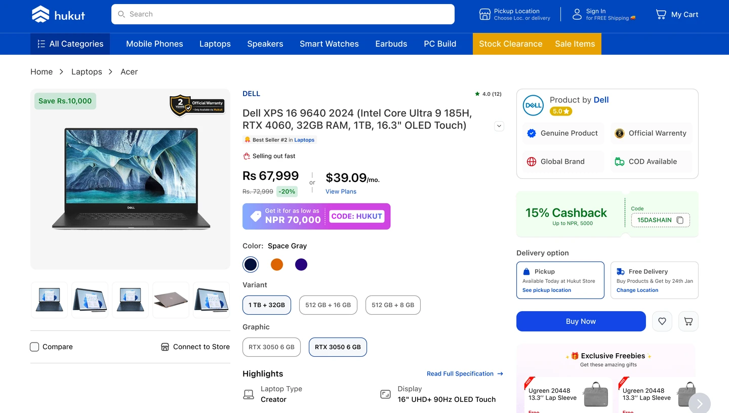
badges doing the job a shop assistant would
Narrowing
569 laptops is not a shortlist.
So the filters are the page, not a drawer — each with a count, so no filter is a dead end.
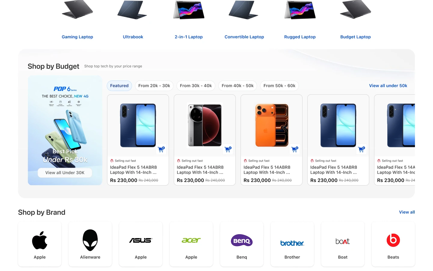
See them whole
Both of the other surfaces, end to end.
Crops argue about a slice. These are the full pages — scrub them.
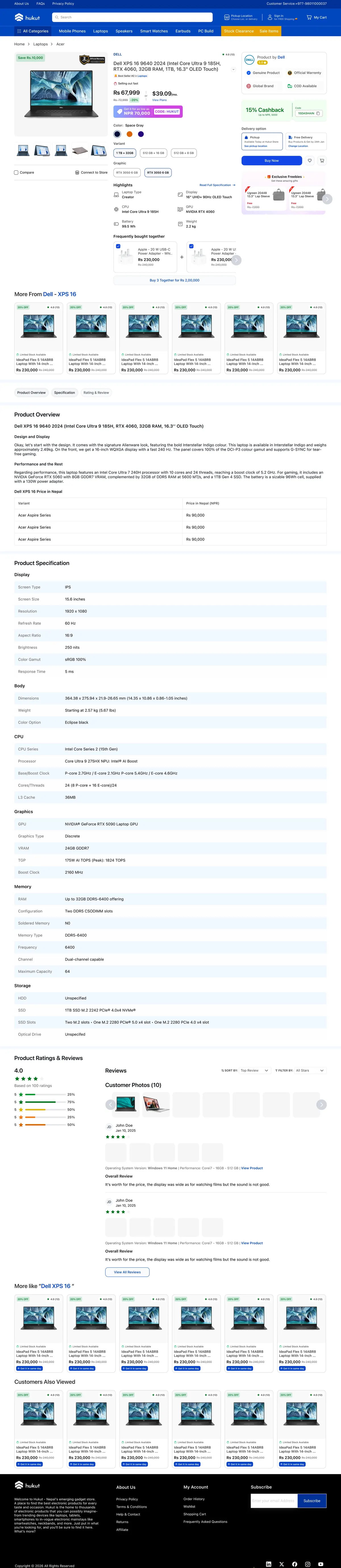
Product page — gallery to reviews.
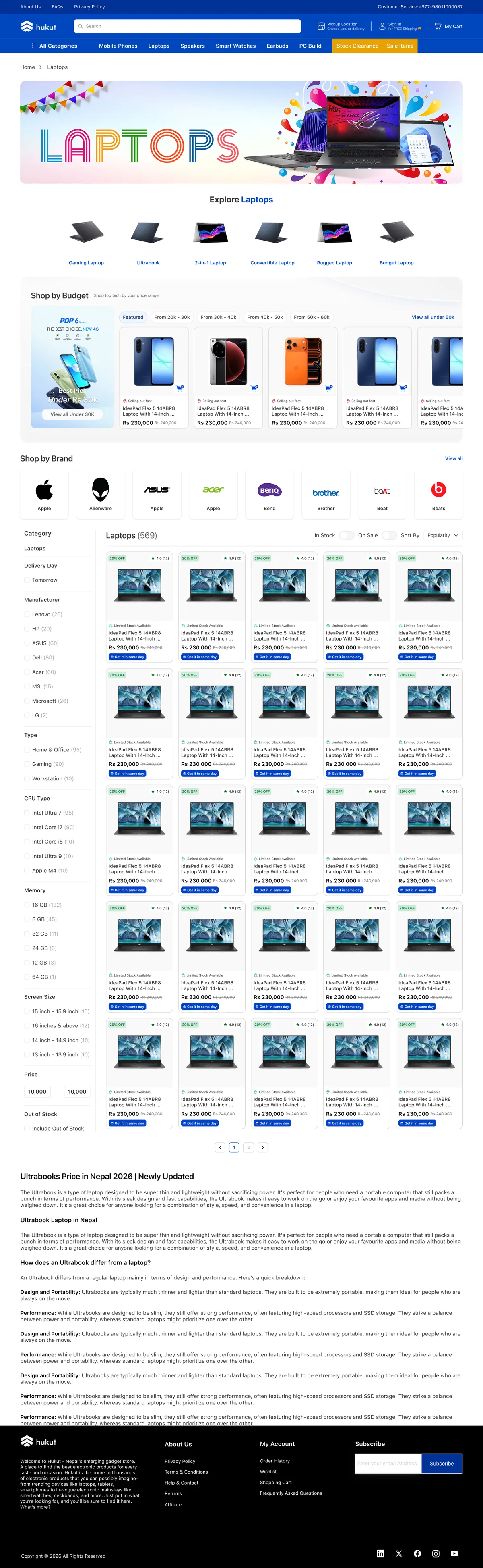
Category page — facets, grid and buying guide.
The system underneath
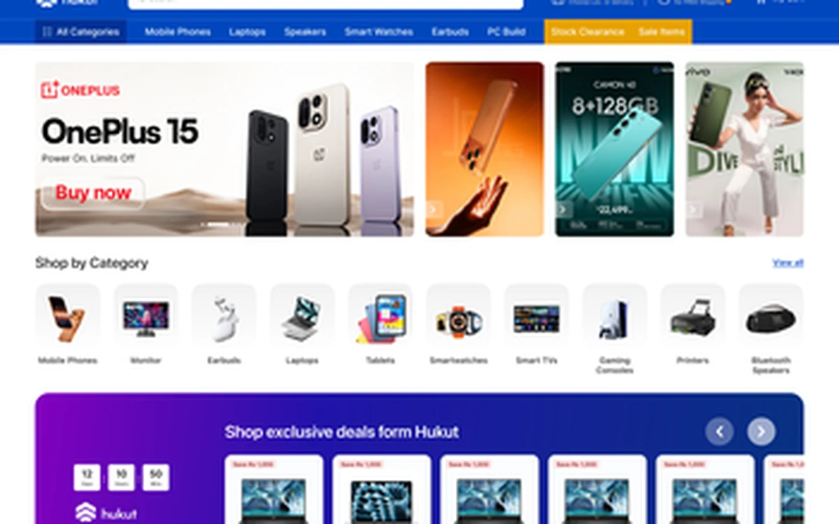
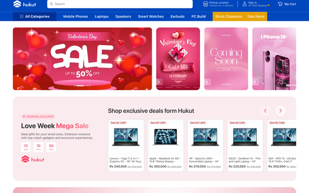
Same shop. Different season.
Valentine’s, Dashain, a flash sale — merchandising changes completely, architecture does not. Marketing can reskin the store without a designer in the room.
Impact
People started staying. Then they started buying.
Sales went up. So did the time people spent in the store before leaving it. The traffic never changed — what it found did.
What this taught me
A store that shouts is a store you leave.
The old site wasn’t missing features. It was missing an answer to “what should I look at, and why should I believe you?”