Product Design · April 2026
TransferNetDesigning a Remittance App That Answers “Where Is My Money?”
Tl;DR
Money from Australia to Nepal, and never out of sight.
Sign-up, identity checks, a four-step send and a five-stage tracker. One phone, one corridor, no dead ends.
Problem
But.. what is the rate, and where did it go?
Remittance apps ask for a passport before they will quote you, then hide the fee until checkout. After you send, the money is simply gone for a while.
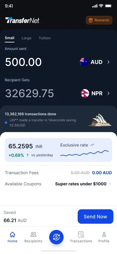
the rate, first
the number that decides the transfer is the first thing on screen
Getting in
Two doors, then one field at a time.
The welcome screen routes rather than sells — new sender or returning, nothing else. Sign-up asks for an email and a password, password recovery states its rules inline instead of rejecting you afterwards, and verification ends on a screen that says so.

route, don’t pitch
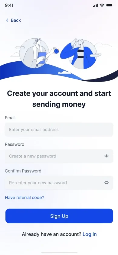
one short form
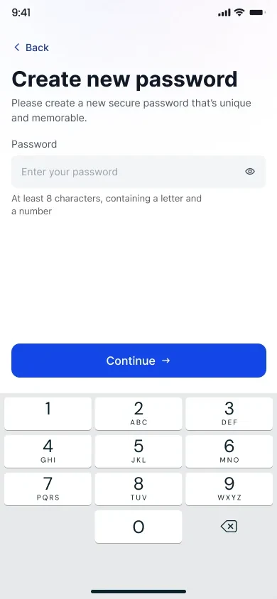
rules before the error
My role
Gate the button, don’t scold the user.
Identity is the step people abandon, so nothing turns red mid-typing. The form stays quiet and the button stays unavailable — completion is the only signal.
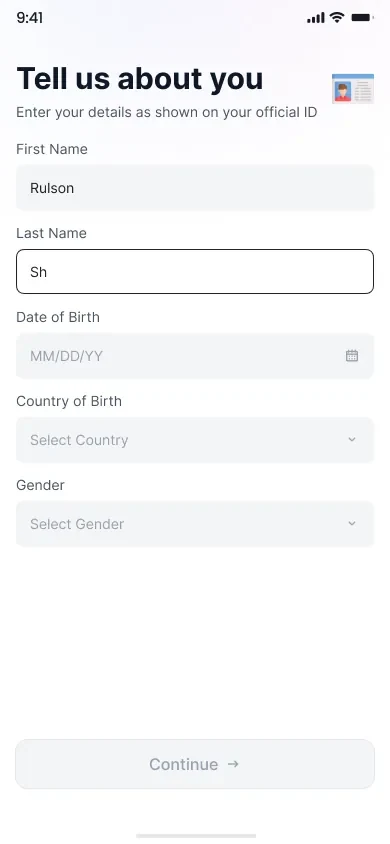
not yet
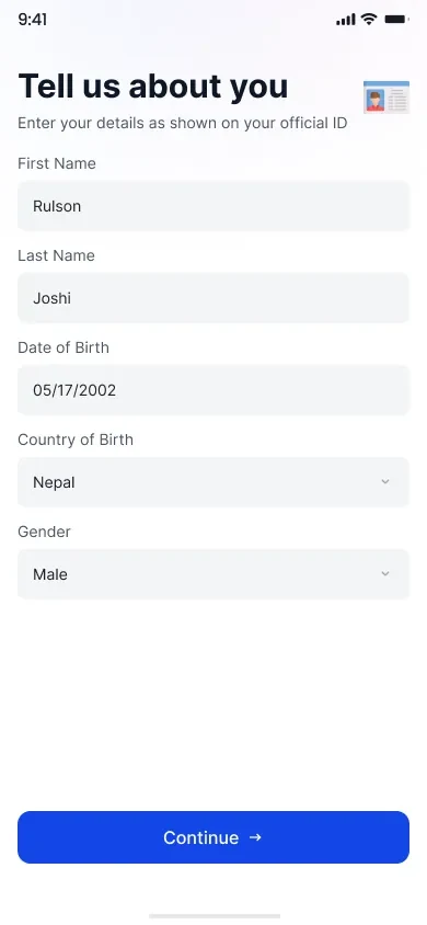
now
The send
A fee you meet at checkout is a fee you hid.
So rate, delivery method, fee and subtotal each get their own row on step one, where they can be read rather than discovered. Step two puts repeat recipients a tap away and gives a first-time sender something to do instead of an empty list.
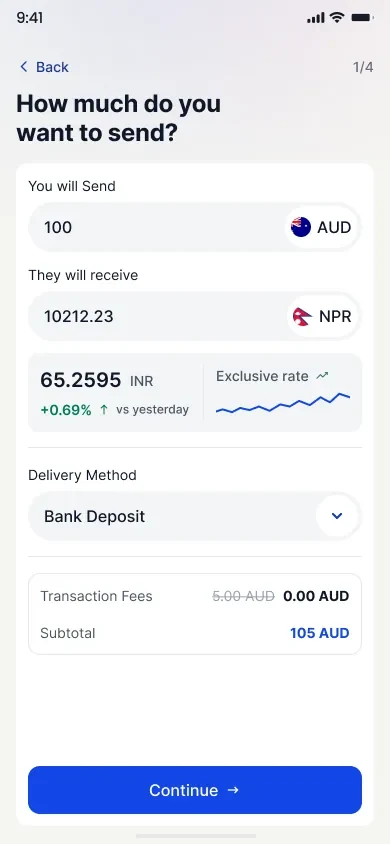
cost, up front

or add a new one
The decision I’d defend
Payment happens outside the app. So prove it inside.
This corridor settles by manual bank transfer, which means the sender leaves, pays, and comes back. So the account details are copyable, the receipt upload is marked required, and Continue stays dead until the evidence is attached.
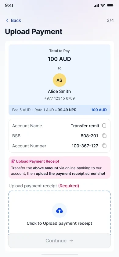
upload payment
the hand-off is copyable and the requirement is not optional
Committing
Show the receipt back before you take the money.
The review screen repeats the amount, the recipient bank, the rate and the uploaded receipt as a thumbnail, so confirming is a check rather than a leap. The screen after it hands over a transfer number and a route straight into tracking.
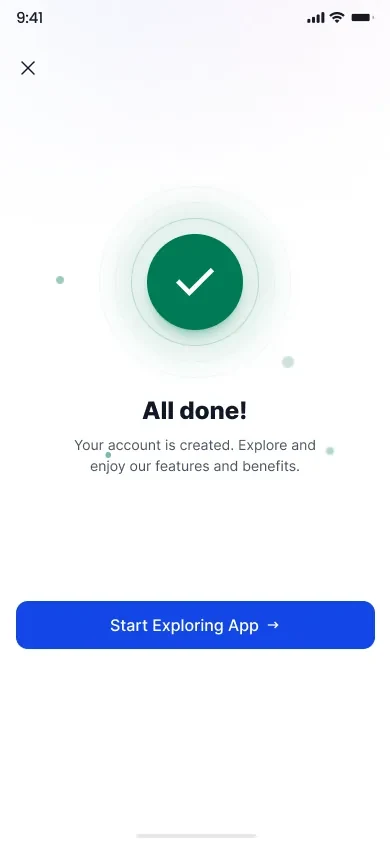
verified, once
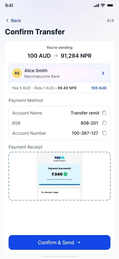
the whole transfer, restated
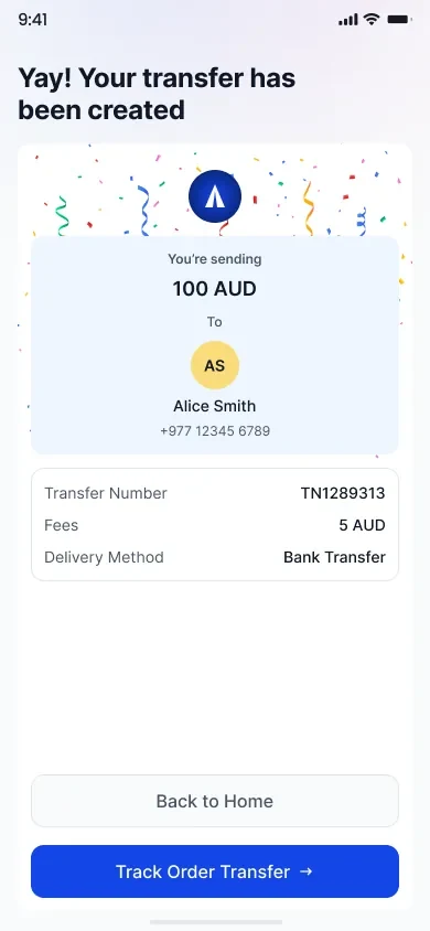
a number to quote
Coming back
The second transfer should be shorter than the first.
Saved recipients carry a send action on the row, so a repeat transfer skips the home screen entirely. The account screen keeps settings shallow and puts what the sender has saved in front of what the app wants to tell them.
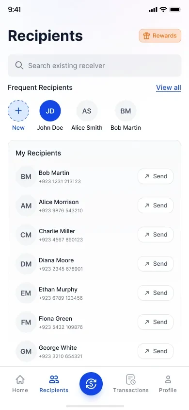
send from the row
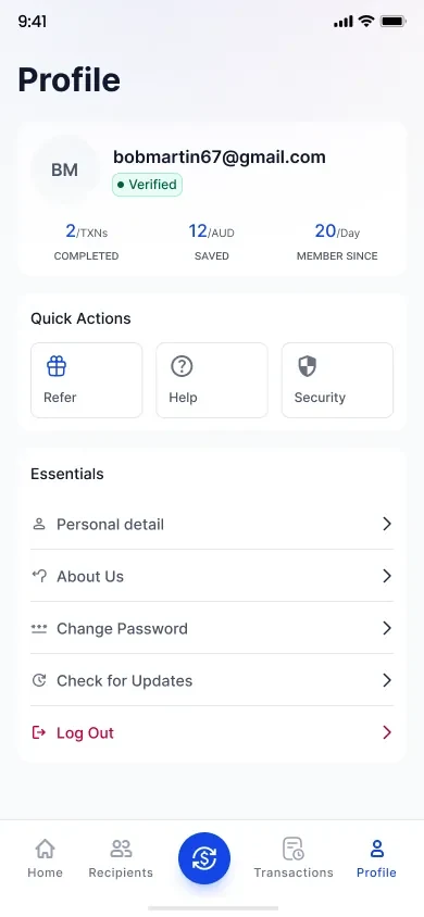
shallow settings
Impact
“Processing” had to mean something.
So the tracker names five stages, the pill always agrees with the timeline, and the history filters on the same words. Sender and recipient sit side by side, because the person asking is usually neither of them alone.
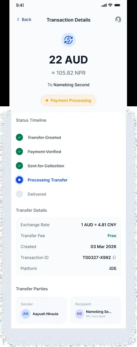
five stages, three states
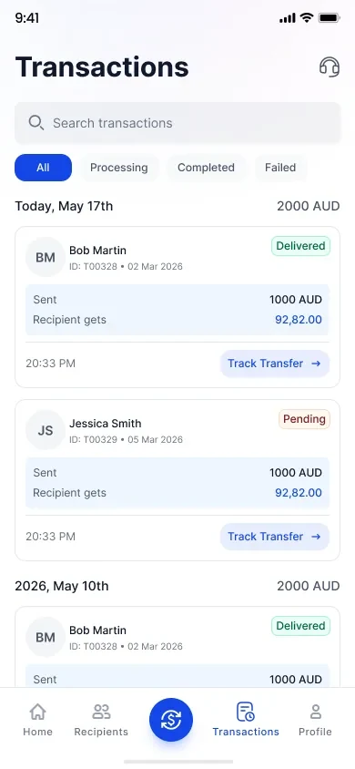
the same words, as filters
What this taught me
When a product moves someone’s wages, ambiguity is the whole risk.
A missing status is not a small gap in a remittance app. It is somebody phoning home to ask whether the rent arrived.