Brand · Web · Front end · Motion

Hospiflo A Hospital System’s Mark, Landing Page and Launch Film

  • Mantra IdeasClient
  • Nov 2026Shipped
  • Logo, site, filmScope
  • Next.js · GSAPBuilt with

seeitliveathospiflo.com

hospiflo.comVisit live site

Tl;DR

One record for the whole hospital. I gave it a face and a front door.

The mark, hospiflo.com designed and built end to end, a few of the dashboard’s screens, and a 35-second launch film cut in code.

01 · The mark

A cross that looks like it flows.

Two rounded halves, one light green and one deeper, meeting on the diagonal. It has to read at 16px in a browser tab and on a hospital wall.

one cross, drawn so it looks like it flows

  • 16px
  • 32px
  • 64px
  • 128px
  • Hospiflo logo on white
  • Hospiflo logo on the dark ink colour
  • Hospiflo logo on a mint tint of the brand green

02 · Landing page

I designed hospiflo.com and wrote every line of it.

Hospital owners have sat through a lot of software demos, so the page does the demo itself: every card is a small working screen, not an icon.

hospiflo.comVisit live site

the hero walks one patient through the departments by itself: visit, lab, billing

Every department, on one record.

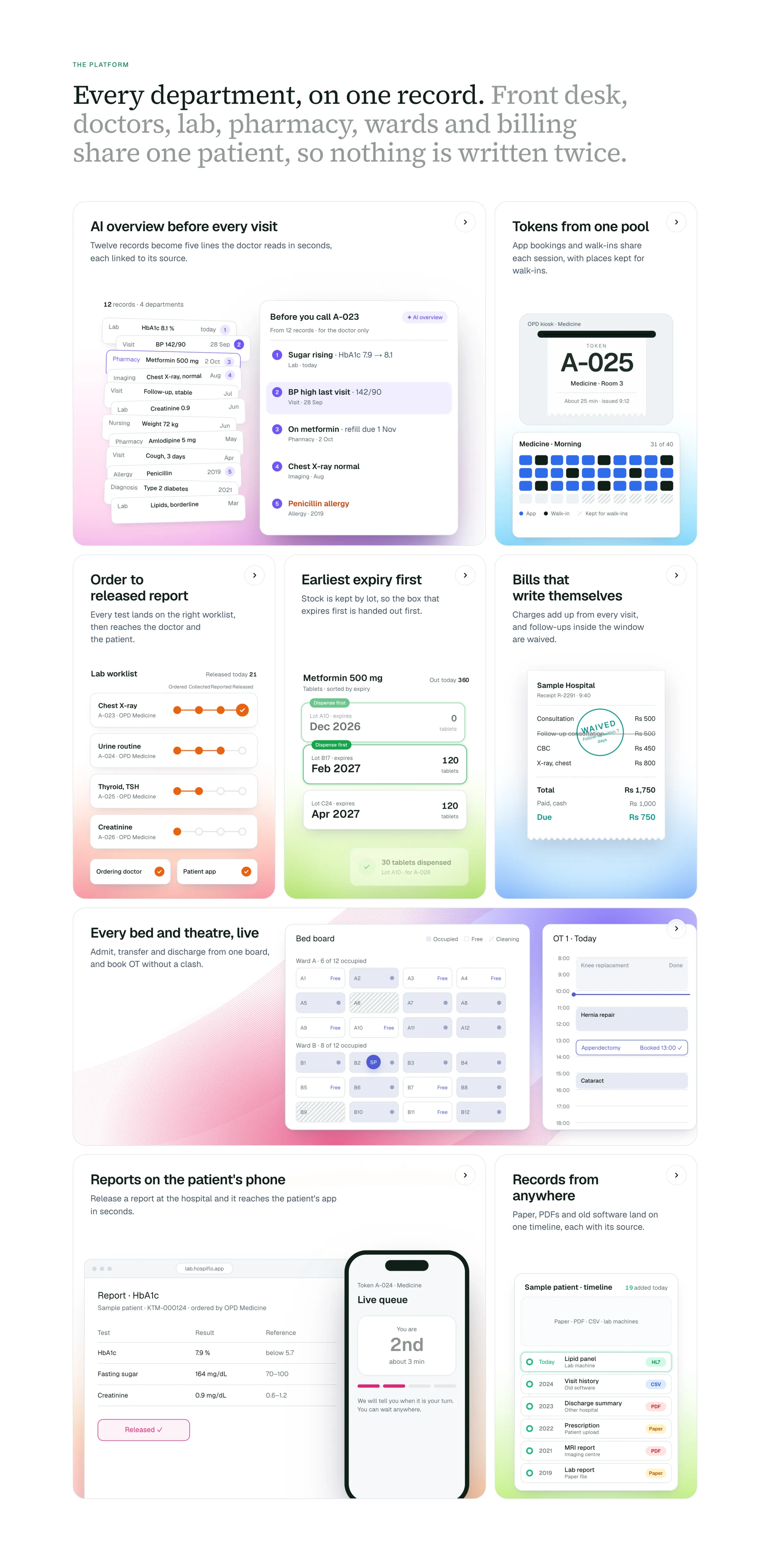
Eight cards, eight departments, each drawn as the screen that department actually uses. Open the pins.

0 of 8 departments, one record

The platform section of hospiflo.com: eight cards, each a small live screen for one department.

Then the rest of the page.

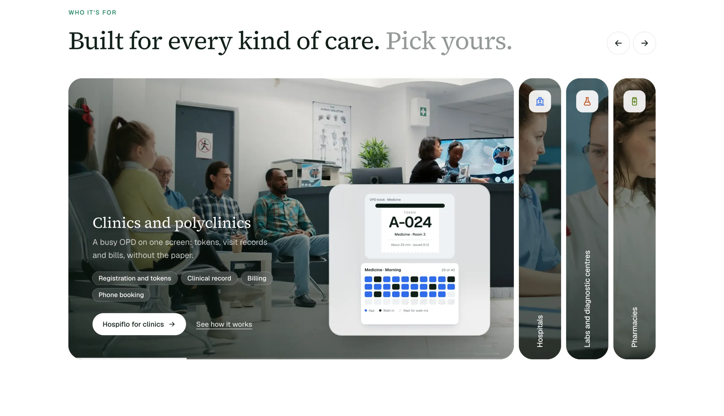
  • Built for every kind of care. Pick yours

    The care section: clinics and polyclinics, hospitals, labs and pharmacies as panels over photographs.
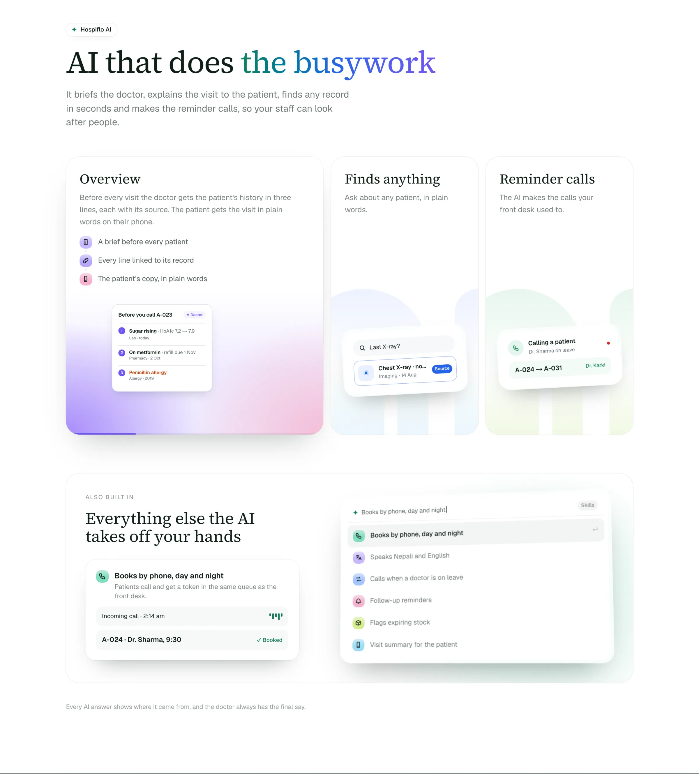
  • AI that does the busywork

    The AI section: the visit overview, finding anything, and reminder calls in Nepali.
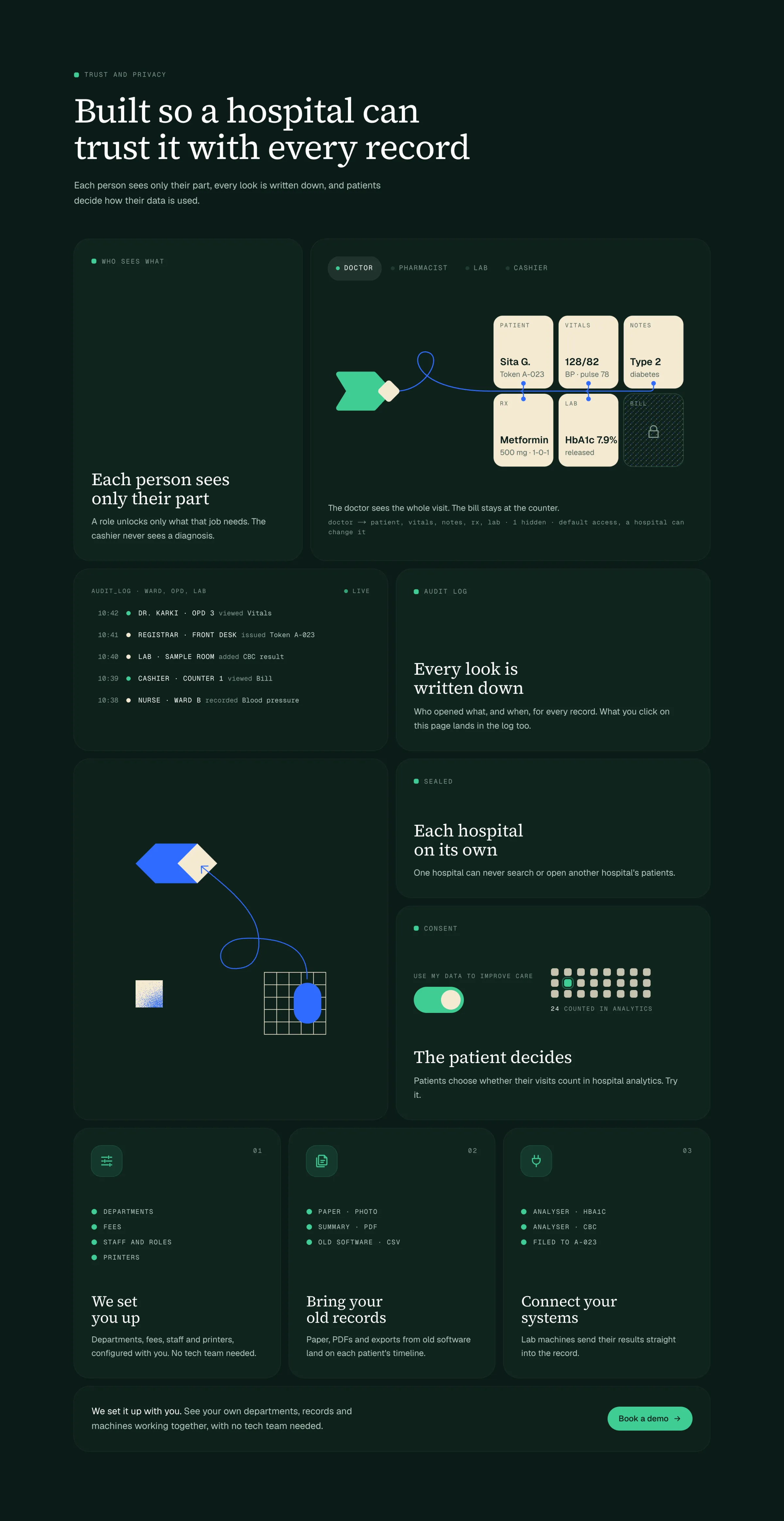
  • The one dark section: trust

    The trust and privacy section on dark green: roles, the audit log, separate hospitals and patient consent.
  • Questions hospitals ask, filtered

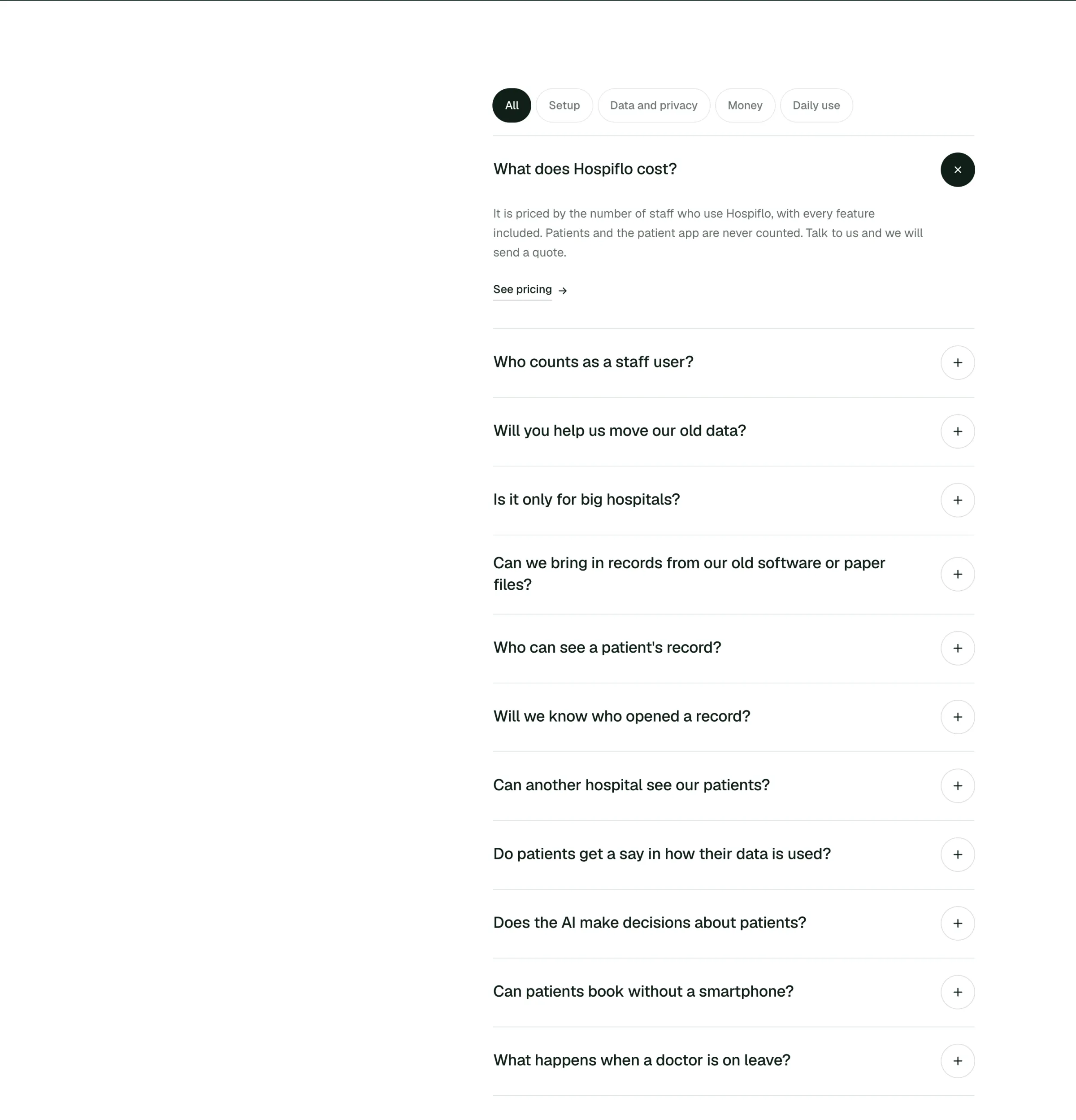
    The FAQ with filters for setup, data and privacy, money and daily use.
  • The same page on a phone

clinics, hospitals, labs, pharmacies, each over a real photo

  • 13feature pages, one per department
  • 4pages for each kind of place
  • 31of my commits on the repo

03 · Dashboard

A few of the screens behind it.

The dashboard is a team’s work; these are screens I designed, as they appear in the film.

  • Tokens: one pool for app and walk-ins

  • The visit, with the AI brief beside it

  • Lab: order to released report

  • The AI line moves a token, in Nepali

  • Front desk to wards, one product

04 · Launch film

35 seconds, made the way the site is made.

Every scene is DOM and SVG on one paused GSAP timeline. A script seeks it frame by frame and hands the frames to ffmpeg, so the film is code, and so is every change to it.

every name, number and patient on screen is made up

What this taught me

Show the work the software does, not the software.

The mark, the cards and the film all say the same thing: a token, a report, a bill, moving through one hospital without being written twice.